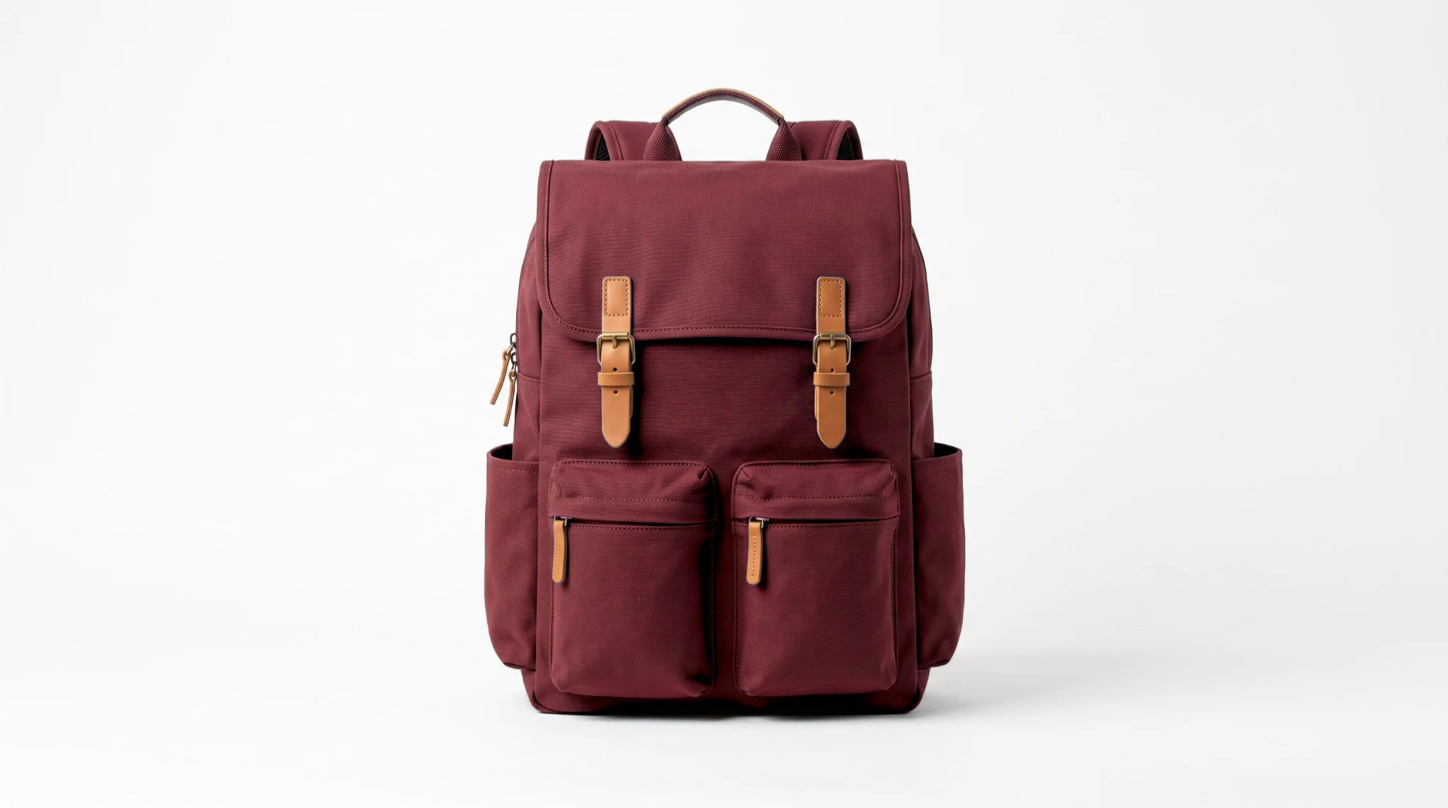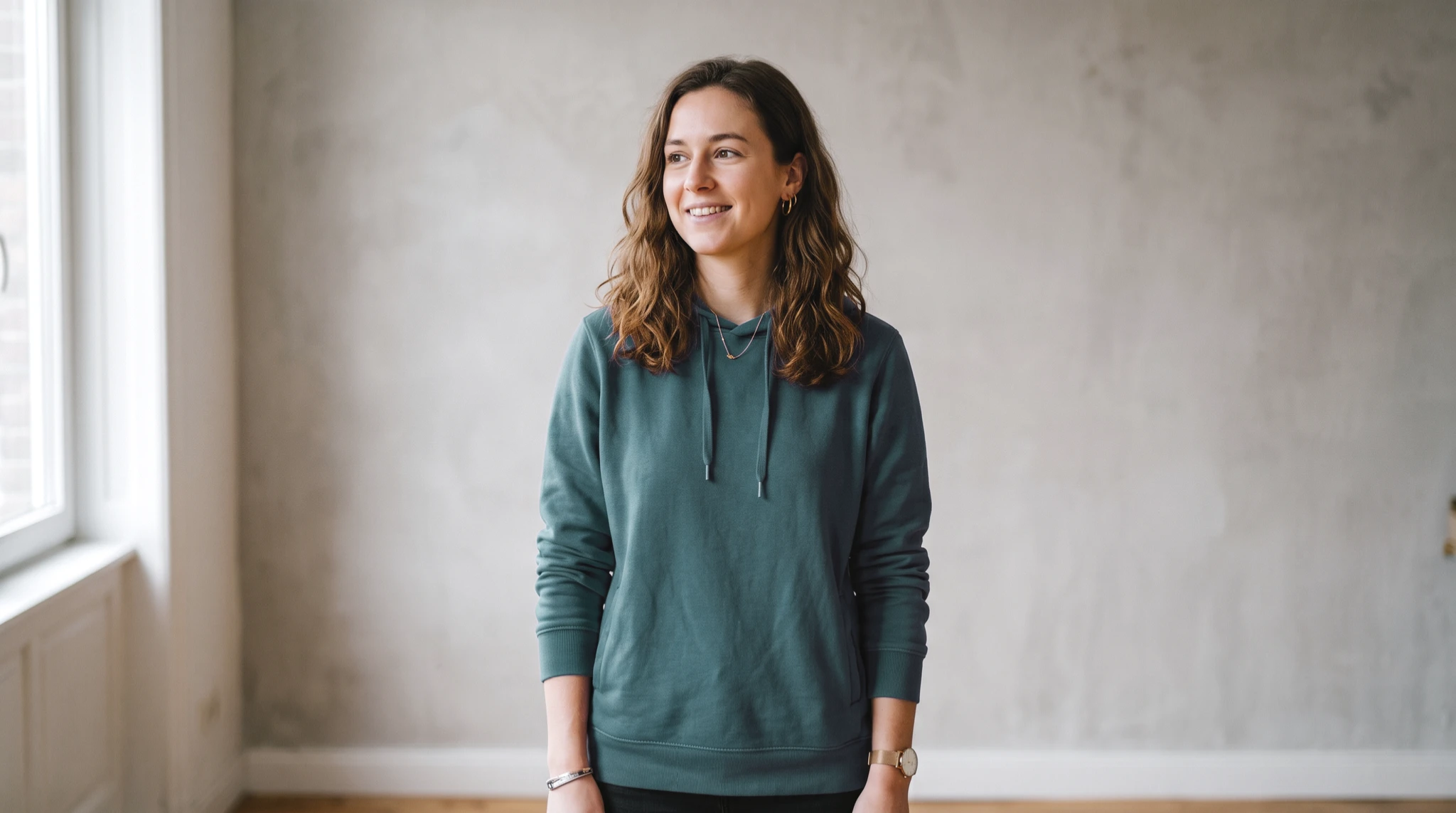
TL;DR. Pick the color you want gone, pick the color you want instead, and choose Realistic to keep the shading or Solid for flat graphics. Tolerance decides how much gets caught. When the object shares a color with something else in the frame, masking is what saves you. This guide covers all four controls and the cases where color replacement is genuinely hard.
What color replacement actually does
It helps to know what is happening under the hood, because it explains every result you will get, good and bad.
A color replacement tool does not understand objects. It does not know that the blue region in your photo is a shirt. What it knows is color: it looks at every pixel, measures how close that pixel is to the source color you picked, and changes the ones that fall within range. Everything follows from that one fact.
It is why a blue shirt photographed against a blue sofa is hard, and why a blue shirt against a wooden floor is easy. It is why a shirt in bright sun and deep shadow needs more tolerance than a shirt lit evenly. And it is why the shape of your object never matters, but the lighting on it always does.
Once you think in terms of color ranges rather than objects, the controls stop being trial and error and start being predictable.
The four controls that decide your result
Every edit comes down to four decisions. Get these right and the rest of the tool is just clicking.
Source: the color you are replacing
This is the single most important choice you make, and the one people rush. The tool builds its entire selection around this one color, so a careless sample produces a careless result.
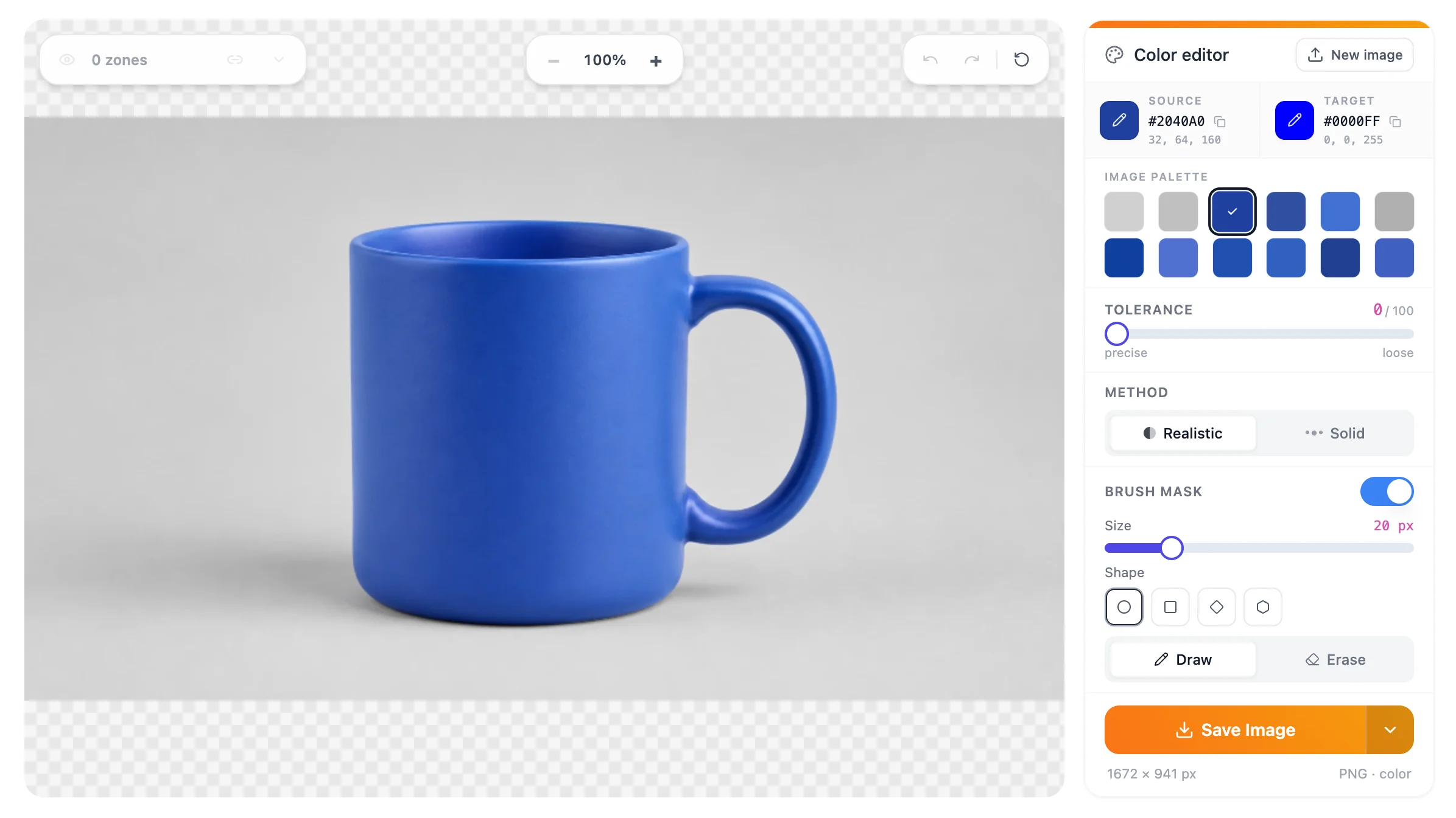
Three ways to set it. The palette shown alongside your image lists the colors the photo actually contains, ordered by how much of the frame each one occupies, so picking the dominant tone of your object is usually one click. You can type an exact hex value if you already know it. And where your browser supports it, the eyedropper lifts a color from anywhere on your screen, including from another window. That control only appears in browsers that offer it, so if you do not see it, use the palette or the hex field instead.
The rule for sampling: pick from the middle of a well-lit part of the object. Not the brightest highlight, which is closer to white than to the real color, and not the darkest fold, which is closer to black. The mid-tone is the color the object actually is, and it gives tolerance the most room to work in both directions.
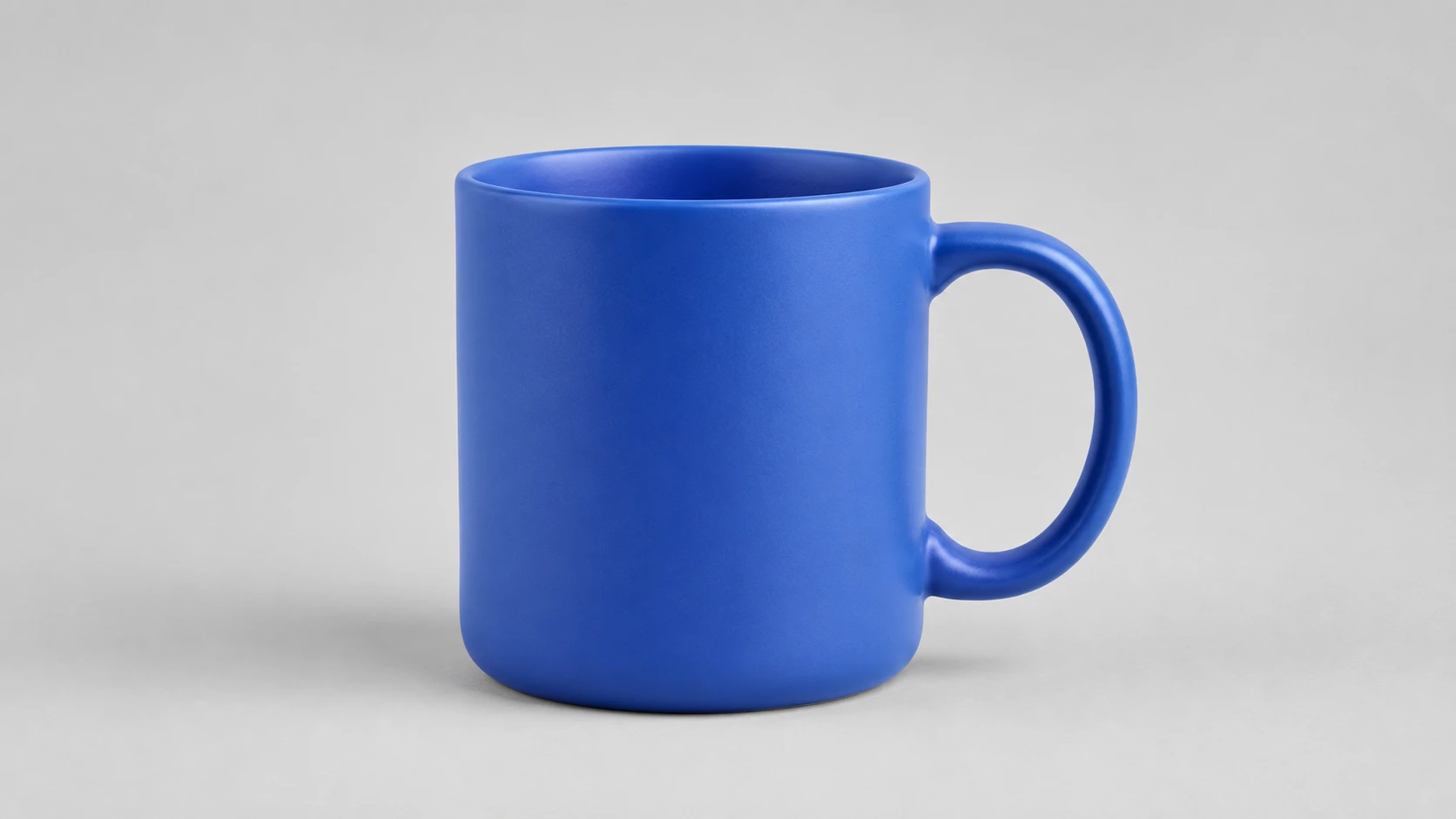
Target: the color you want instead
The target is where you are going. Type a hex code when you have an exact value to hit, such as a brand color, or pick visually when you are exploring.
One thing worth knowing early: how faithfully you land on the target depends on where you started. Replacing a strong, saturated color with another strong color is close to exact. Replacing a very pale or near-gray color with a vivid one is not, because the original simply does not carry enough color information to push that far. This is a property of the image, not a limitation you can configure around.
Method: Realistic or Solid
This choice decides whether your result looks like a photograph or a graphic, and picking the wrong one is the most common reason an edit looks off.
Realistic preserves the shading of the original. The bright parts of your object stay bright, the folds stay dark, and the texture survives. A cotton shirt still looks like cotton. This is what you want for clothing, painted surfaces, furniture, packaging and anything photographed under real light.
Solid replaces the color flatly. There is no shading to preserve because you do not want any. This is the right choice for logos, icons, flat illustrations, diagrams and any graphic that was drawn rather than photographed. Using Realistic on a flat logo leaves faint variation where the design should be perfectly even.
A simple test: if the thing you are recoloring was lit by a light source, use Realistic. If it was drawn in software, use Solid.
Tolerance: how much gets caught
Tolerance is the radius around your source color. Low tolerance catches only pixels very close to the sample. High tolerance sweeps in neighboring shades.
Work upward, not downward. Start low, look at what got missed, and raise it until the object is fully covered. The moment you see color bleeding into something you wanted left alone, you have gone one step too far. Back off and solve the rest with masking instead.
Objects photographed under even light need surprisingly little tolerance. Objects with strong highlights and deep shadows need much more, because the same material spans a wide range of values across the frame.
Masking: the fix for shared colors
Everything above works on color alone, which leaves one problem unsolved: what happens when two different things in your photo are the same color. Raise tolerance enough to catch all of your blue shirt and you also catch the blue sofa behind it. Lower it enough to spare the sofa and half the shirt is missed.
Masking breaks the deadlock by adding a second condition. Instead of asking only “is this pixel the right color”, the tool now also asks “is this pixel inside the area I was told to work in”. Both must be true. You draw over the region you care about, and everything outside it is protected no matter what color it is.
You can draw with different brush shapes and sizes, erase parts of what you drew, and build up several separate zones in one image. Coverage matters more than neatness: the color matching still runs inside the region you drew, so a rough outline that comfortably covers the object works just as well as a careful one. You are marking a working area, not cutting out the object.
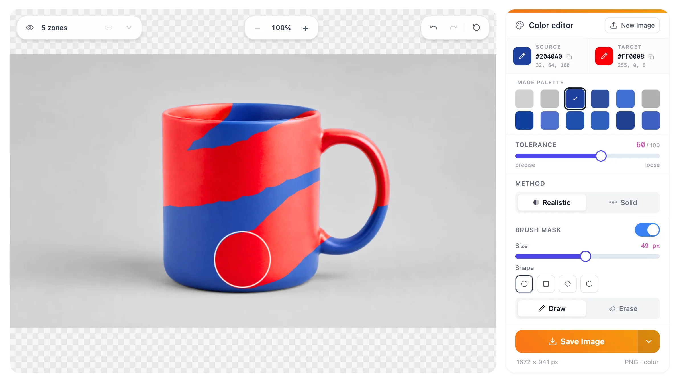
On the image itself a zone is just an area you have painted over. Everything inside it is fair game for the swap, and everything outside it keeps its original color however closely it matches your source.
This is the control that turns color replacement from something that works on easy photos into something that works on real ones.
A full walkthrough, start to finish
Putting all four controls together, here is the order that gets you to a clean result with the fewest corrections.
- Upload your image. PNG, JPG, WEBP or HEIC, from wherever you keep it. The palette appears alongside it, listing the colors the image actually contains.
- Set the source. Click the dominant tone of your object in the palette, or sample a mid-tone from the object itself. Avoid highlights and shadows.
- Set the target. Type a hex value if you have one, otherwise pick visually.
- Choose the method. Realistic for anything photographed, Solid for anything drawn.
- Raise tolerance until the object is covered. Stop as soon as color starts reaching where it should not.
- Mask if anything else shares the color. Draw over the object and the rest of the frame is protected.
- Save. The result downloads as a PNG, which keeps the edges sharp.
The whole sequence takes seconds once you have done it a couple of times. The tool works on one image at a time, so when you have a set to get through, the speed comes from settling on your settings once and then working through the set in a single focused session.
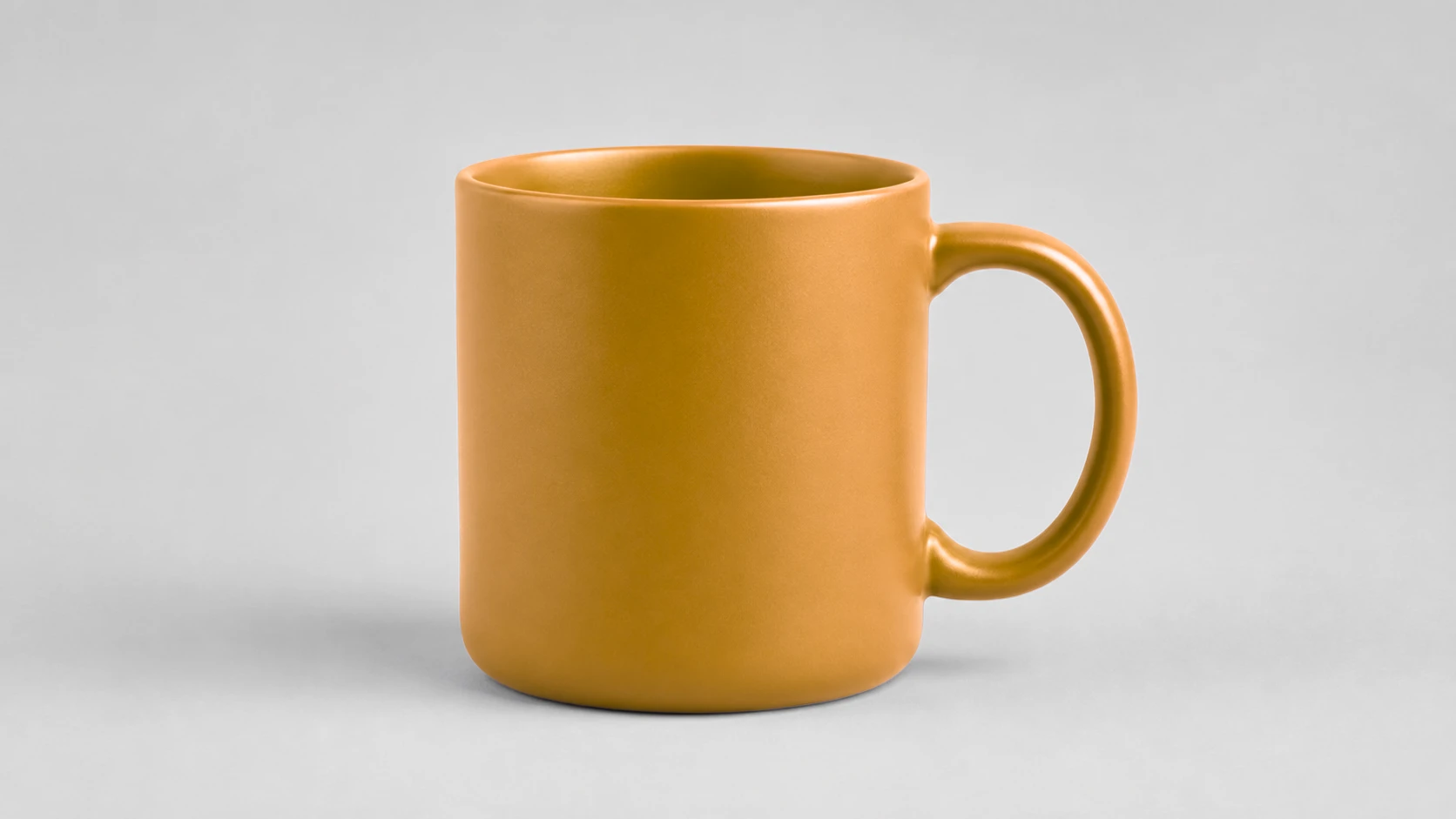
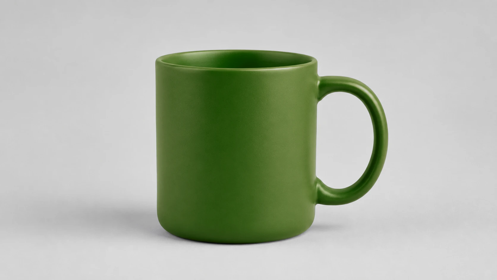
Changing more than one color
Everything so far describes one pass: one source color out, one target color in. Real images often need two. A mug that is blue with a red stripe, a logo in three colors, a jacket where you want the body one shade and the trim another.
A pass always reads from the image you loaded, so simply picking a second source after finishing the first would throw the first change away rather than add to it. What you need is for the result to become the new starting image.
That is what the arrow beside Save Image is for. Open it and choose Continue, and the result you are looking at is reused as the new image. The palette is read again from it, so the color you want to change next is right there to pick.
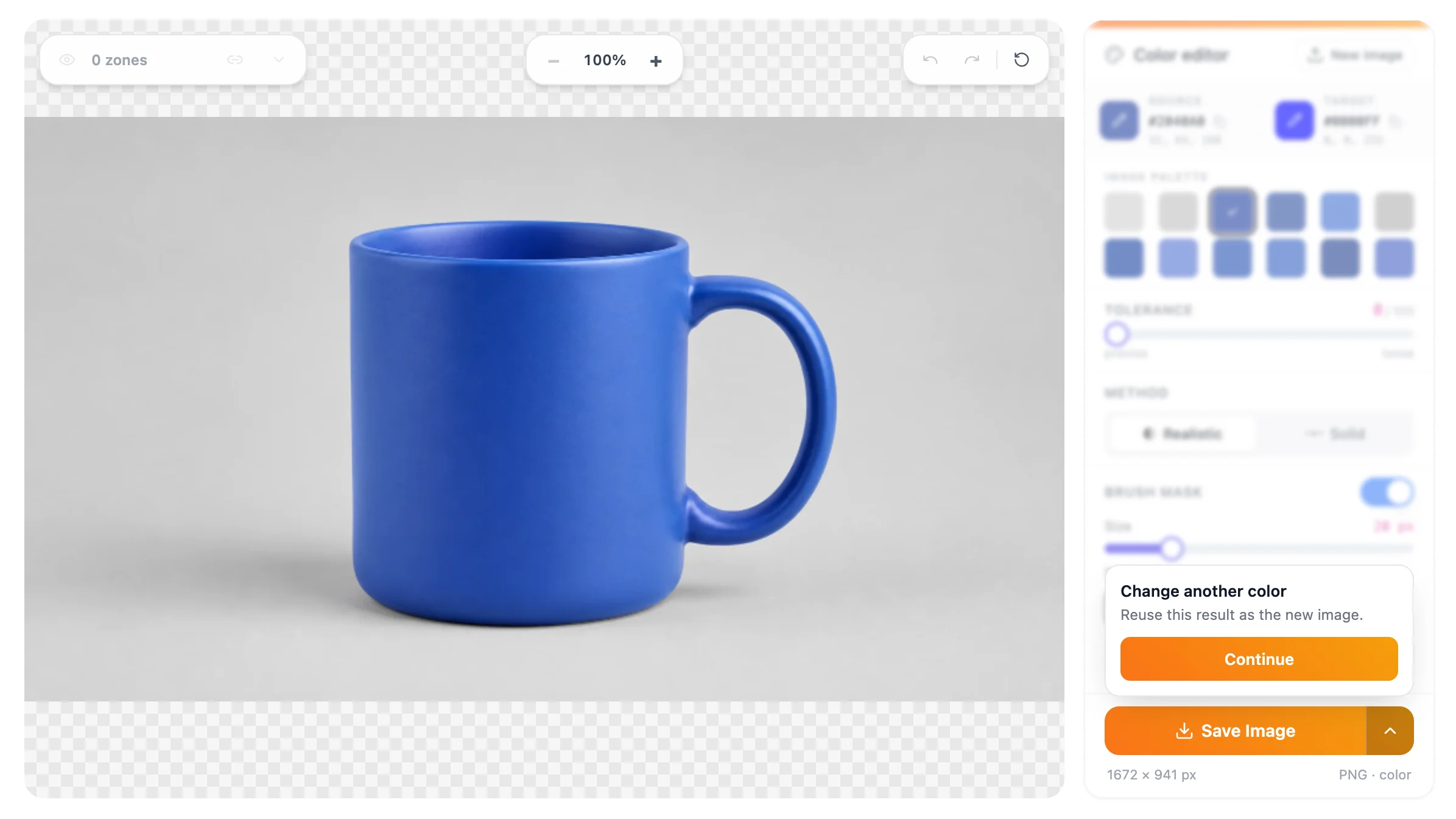
Two things worth knowing before you use it. It does not save a file, so press Save Image first if you want a copy of the intermediate stage. And because it starts from a fresh image, any zones you have drawn are cleared, which the tool warns you about when there are zones to lose.
Repeat as many times as the image needs. Each pass is the same four decisions, and the only difference is that your starting image already carries the changes you made before it.
The cases that are genuinely hard
Being honest about the limits saves you more time than any tip. Four situations are difficult regardless of technique.
Very pale or near-white originals. There is almost no color information in a near-white pixel, so pushing it to a vivid target has little to work with. Recoloring a white shirt to bright red will look tinted rather than dyed. Going the other way, vivid to pale, works fine.
Transparent and reflective materials. Glass, water and polished metal take their color from what is around them. Replacing that color changes the object without changing anything it reflects, so the result reads as wrong even when the swap itself is technically clean.
Soft edges and fine detail. Hair, fur, feathers and motion blur produce pixels that are a blend of the object and its background. Those blended pixels cannot belong fully to either, so a boundary will always be visible under close inspection.
Heavy compression artifacts. A JPG that has been saved, shared and re-saved many times has color noise smeared around its edges. The tool sees that noise as real color, which produces a speckled result. Starting from the highest quality version of the image you have is the only real fix.
Where to go from here
Color replacement is often one step in a longer edit. Three directions come up most often, and each has a guide of its own.
If you sell online and need the same product in several colors, the practical question is which colorways are worth producing and how to keep them consistent across a listing. That is covered in producing every color variant from one product photo.
If you are matching artwork to a brand palette, the challenge is hitting an exact hex value rather than something that merely looks close. See changing a logo or brand color to an exact hex.
And if you are recoloring clothing, which is the most common request of all, the fabric-specific advice is in changing clothing color in a photo.
One last combination worth knowing: recoloring works best against a clean background, and a clean background is exactly what the AI Background Remover produces. Removing a busy background first removes most of the color conflicts before you start, which often means you need no masking at all.