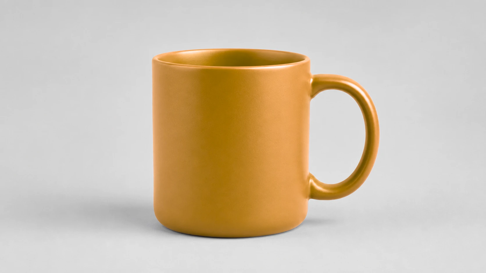
TL;DR. Photographing every colorway of a product means owning, styling and shooting every colorway. Starting from one well-lit photo of your most saturated colorway, you can produce the rest with identical lighting and framing, which looks more consistent than separate shoots. The one rule that matters: only show colors you can actually ship, and check the swap against the real item.
The colorway problem, in numbers
A product that comes in six colors is six photoshoots. Six times you unpack, style, light and shoot the same item, and six times you edit the results. If you carry twenty such products, the arithmetic gets unpleasant quickly.
Worse, the six shoots will not match. Light shifts through the day, the item sits a few degrees differently in the frame, the shadow falls slightly longer. Buyers do not consciously notice any single difference, but they do register a gallery that feels uneven, and unevenness reads as amateur.
Recoloring inverts the problem. One photograph becomes the master, and every colorway inherits its lighting, framing, shadow and camera angle exactly. The variants match each other precisely because they are the same photograph.
Choosing the photo you start from
The master photo determines the ceiling for every variant, so it is worth choosing deliberately rather than grabbing whatever is nearest.
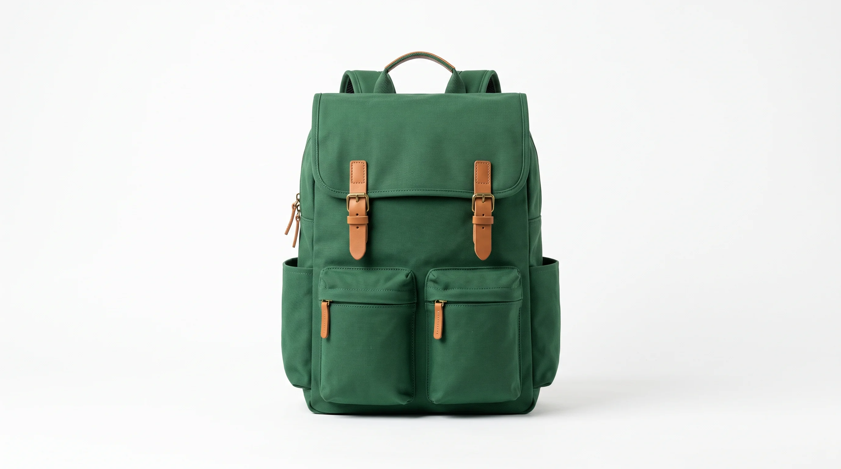
Start from a saturated colorway, not a pale one. A strong, richly colored original carries the most color information, and it converts cleanly into both lighter and darker targets. A white or beige original has almost nothing to work with, and pushing it toward a vivid color produces something tinted rather than genuinely colored. If you stock a forest green and a cream version of the same bag, shoot the green one.
Light it evenly. Even lighting keeps the product's color within a narrow range, which means less tolerance is needed and less of the surrounding frame is at risk. Hard direct light creates blown highlights that carry no color at all and will stay pale through every swap.
Avoid a background that shares the product's color. A green bag on a green surface is the hardest possible starting point. A neutral surface, or better still a clean white one, removes the conflict before it arises.
The variant workflow
Three stages, in this order. The order matters more than it looks, because each stage removes a problem the next one would otherwise have to solve.
Clean the background first
Before touching color, isolate the product. Running the master photo through the AI Background Remover and placing it on a clean white background does two useful things at once. It gives you the white-background product image that most marketplaces expect, and it eliminates every color conflict between the product and its surroundings.
That second effect is the one people underestimate. With the background gone, there is nothing left in the frame that can accidentally share your product's color, which usually means you can skip masking entirely and let tolerance do all the work.
Produce each colorway
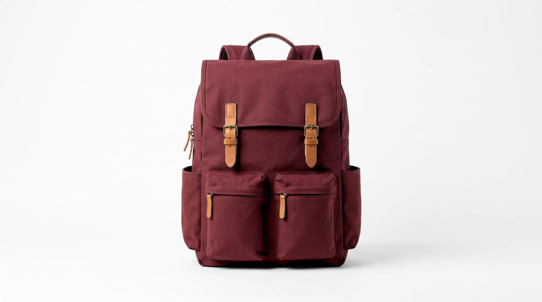
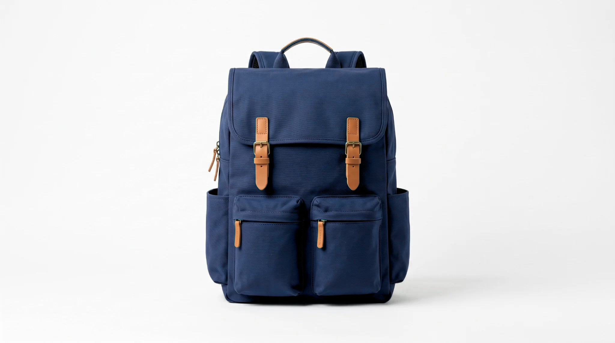
With a clean master, each variant is the same short sequence: set the source to the product's dominant color, set the target to the colorway you are producing, keep the method on Realistic so the fabric texture and shadows survive, and raise tolerance until the whole product is covered.
Realistic is doing the important work here. The highlight along the top of a bag and the shadow under its flap are what make it read as a real object rather than a flat shape. A variant that loses them looks like a color swatch, and buyers can tell.
Because every variant starts from the same master with the same settings, the set stays coherent. Save each one as you go, named for its colorway, so the files match the variant names in your listing.
Check against the real product
This is the stage people skip, and it is the one that protects your return rate. Put the variant image next to the real item in daylight and compare. Screens exaggerate saturation, and a target color that looked right on your monitor can be noticeably louder than the product in hand.
Where they differ, adjust the target and produce the variant again rather than shipping something you already know is optimistic. A buyer comparing your photo to the item on their kitchen table is doing exactly this comparison, just later and with the ability to leave a review.
Which colorways to produce
More variants is not better. Every image you publish is a promise, so the list should map exactly onto what you can put in a box.
- Only colors you stock. A variant image for a color you cannot ship generates enquiries you have to answer and disappointment you have to absorb.
- Lead with the strongest seller. The main listing image should be the colorway that converts best, not the one that happens to be your master photo. Recolor the master into your hero color if they differ.
- Order the gallery deliberately. Neutrals tend to reassure and brights tend to attract. Which goes first depends on your category, but the order should be a decision rather than the order you happened to produce them in.
- Keep the file names honest. Naming the file for its colorway sounds trivial until you are matching twelve images to eight variant options under time pressure.
Where accuracy matters
Marketplaces do not object to edited photos. Product photography has always been edited, and clean cutouts on white are the established norm rather than a trick. What every platform objects to, and what buyers punish through returns, is an image that does not represent what ships.
The practical test is simple. If a buyer holds the item next to your photo and their reaction is “yes, that is it”, the edit is fine. If their reaction is “this is more muted than the picture”, the edit has cost you money, whatever any policy says.
Two habits keep you on the right side of that line. Verify each variant against the physical product in daylight before publishing, and be conservative with saturation: a slightly understated variant photo produces a pleasant surprise, while an overstated one produces a return.
Platform-specific photo guidance
The colorway workflow above is the same everywhere, but what each marketplace expects from the surrounding images is not. Image requirements, gallery conventions and buyer expectations differ enough to be worth reading separately.
There is a general guide covering the major selling platforms, with deeper coverage for eBay, Etsy, Shopify and Temu. If you are new to the color controls themselves, the full guide to changing color in a photo covers source, target, method and tolerance in detail.