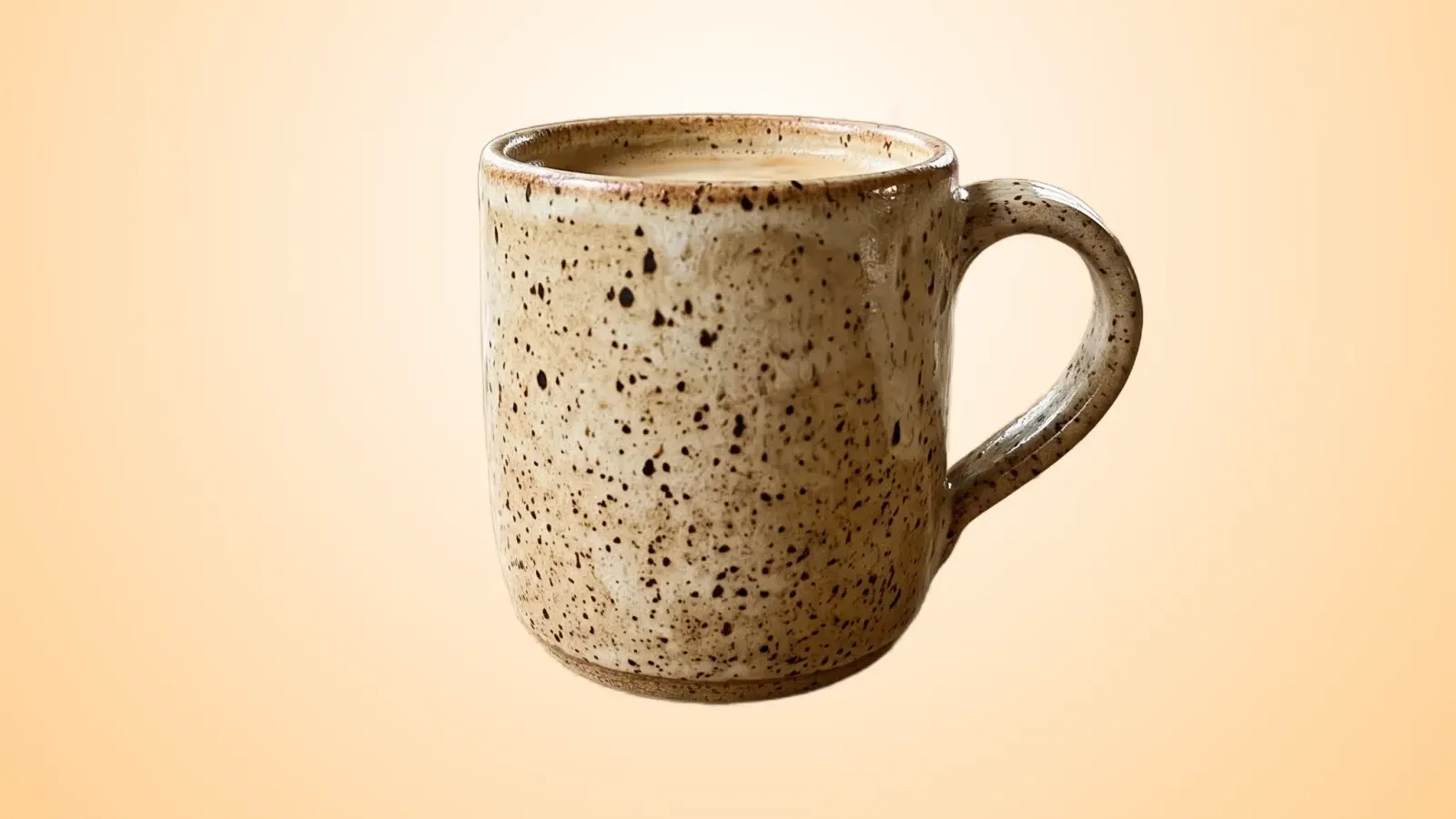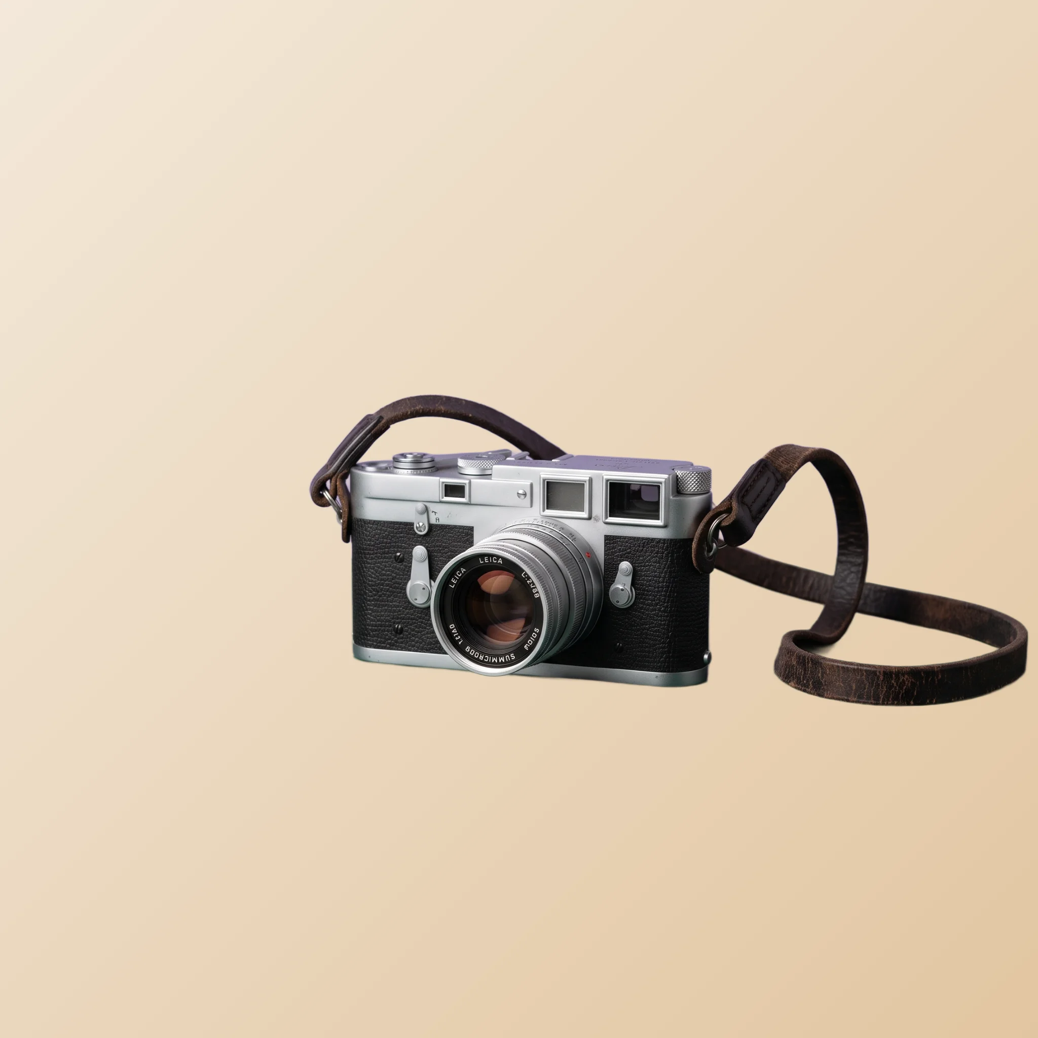
TL;DR. Shopify catalog photography is a different game from listing platforms. The job is not winning one click on one product; it is building a coherent catalog across hundreds or thousands of SKUs that signals a serious brand. This guide covers the consistency principle, photo types by surface, the variants problem, and a workflow that scales without burning you out.
Why Shopify is a different game
Listing platforms like eBay and Vinted compete on individual items. Each listing is a small, isolated battle. Shopify stores compete on the whole catalog at once. A shopper who lands on your store evaluates the entire range, not just the item they clicked, and consistency across that range is what signals “real business” versus “side hustle”.
The implication for photos: every product image is part of a system. One inconsistent shot in a grid of fifty makes the whole grid feel amateur. The mismatched shot is the one that catches the eye, and not for the right reasons. Catalog-wide visual coherence beats per-product polish every time.
The second implication: photos are a brand asset, not just a decision aid. Buyers who liked your store last time recognize the visual style next time they visit. Consistency builds familiarity, and familiarity builds repeat purchase. A marketplace seller sells one item; a Shopify store sells a relationship. The photos do the early work of that relationship.
The catalog consistency principle
If you take only one idea from this article, take this: pick one product-photo treatment and apply it identically across every SKU in your store. Same background color. Same lighting direction. Same shadow style. Same crop ratio. Same proportion of frame the product occupies.
That sounds obvious until you actually try to do it. Most stores grow organically: the first ten products were photographed in a kitchen with window light, the next twenty in an apartment with overhead lighting, the next fifty during a weekend studio rental. The catalog ends up looking like three different stores stapled together.
AI background removal makes catalog consistency cheap. Whatever the original lighting, surface, or studio, the AI returns a clean cutout. You composite every cutout onto the same exact background color, and the result is uniform. The work that used to require studio infrastructure now requires the same background hex code across every product page.
Photo types by surface in your store
Different surfaces in a Shopify store want slightly different photo treatment. The trick is keeping all of them tied back to a single master file per product so the visual system holds together.
Product detail page (PDP)
The PDP is the deep evaluation surface. Buyers arrive curious and leave either committed or gone. They want multiple angles, detail close-ups, scale references, and confidence in the product.
The first PDP image is your master cutout: product centered on a neutral background, filling 70% to 90% of the frame, no other objects. Subsequent gallery images include angle views, detail close-ups for texture or materials, scale references next to a familiar object, and (where relevant) a lifestyle context shot. The variety reduces the buyer's anxiety; the consistent treatment of the cutouts holds the visual brand together.
Collection grid
The collection page is the discovery surface where buyers scroll product after product. This is the surface where consistency matters most. Every product in the grid uses the same crop, same background, same product-to-frame proportion. The eye glides across the grid easily, comparing items based on the items themselves rather than getting distracted by photo-style differences.
Here is the effect with three products that were originally photographed in completely different places, on different surfaces, in different light:

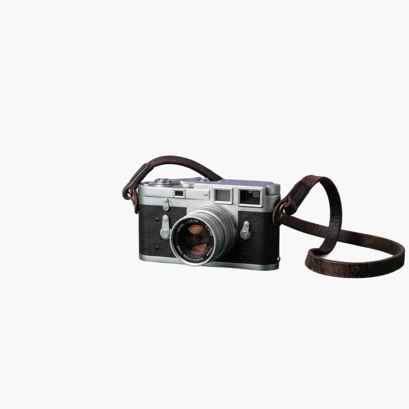
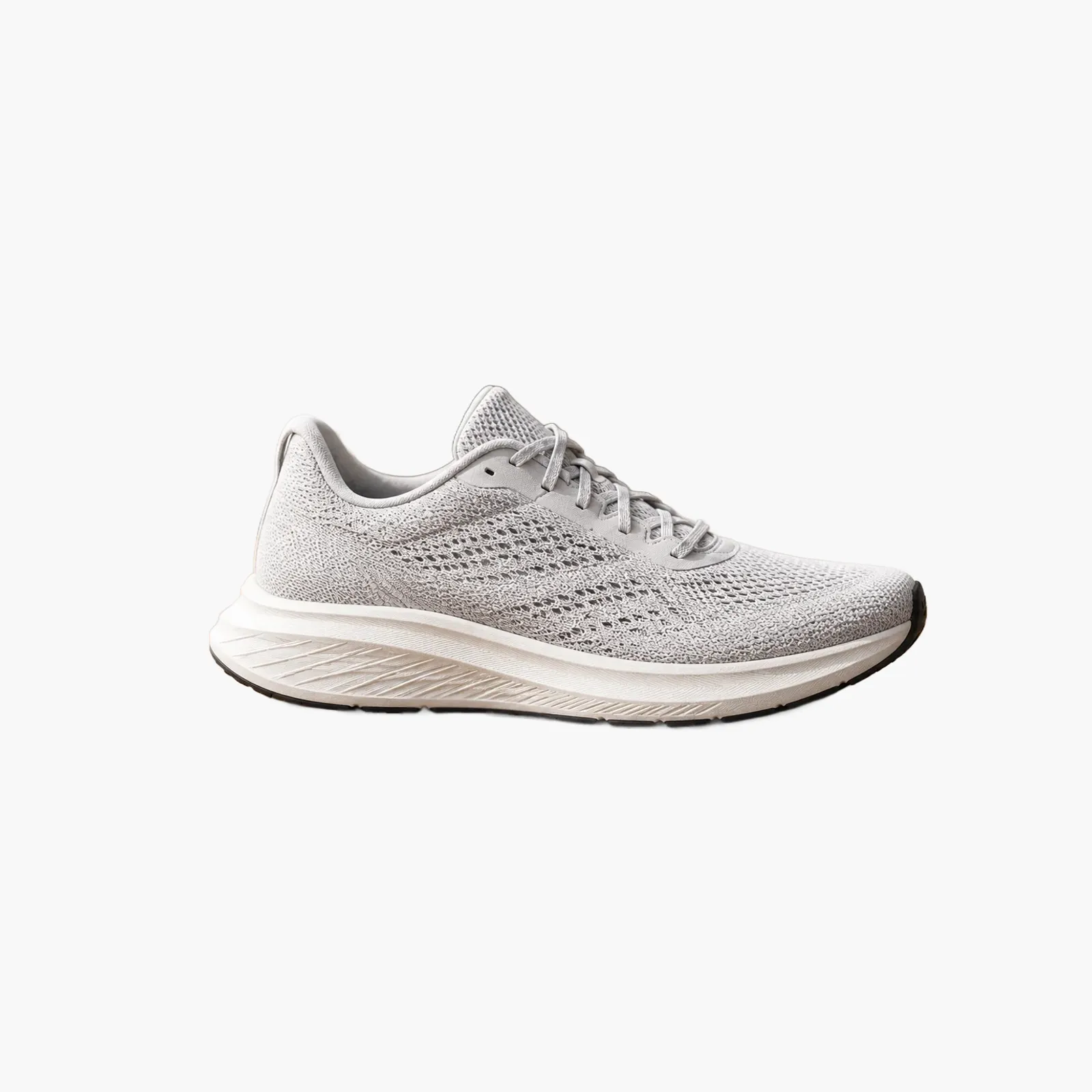
Use the same source image as your PDP main shot, sized down to whatever your theme uses for grid thumbnails. The PictTools Image Resizer adapts one master file to multiple grid sizes. Do not crop differently for the grid; buyers expect the thumbnail to match the larger image they get on click.
Hero images and category banners
Hero images and category banners are brand expression, not catalog assets. This is the only surface in your store where lifestyle photography clearly wins over cutouts. A model wearing the product, a styled scene with multiple items, a seasonal moodboard. The hero says who you are; the catalog says what you sell.
Even here, AI background removal helps. Composite isolated product cutouts onto styled scenes, swap seasonal backgrounds without re-shooting the products, refresh hero rotations without a studio. The tool's image backdrop option places your cutout onto any scene you provide, which gives you compositing flexibility that pure photography does not.
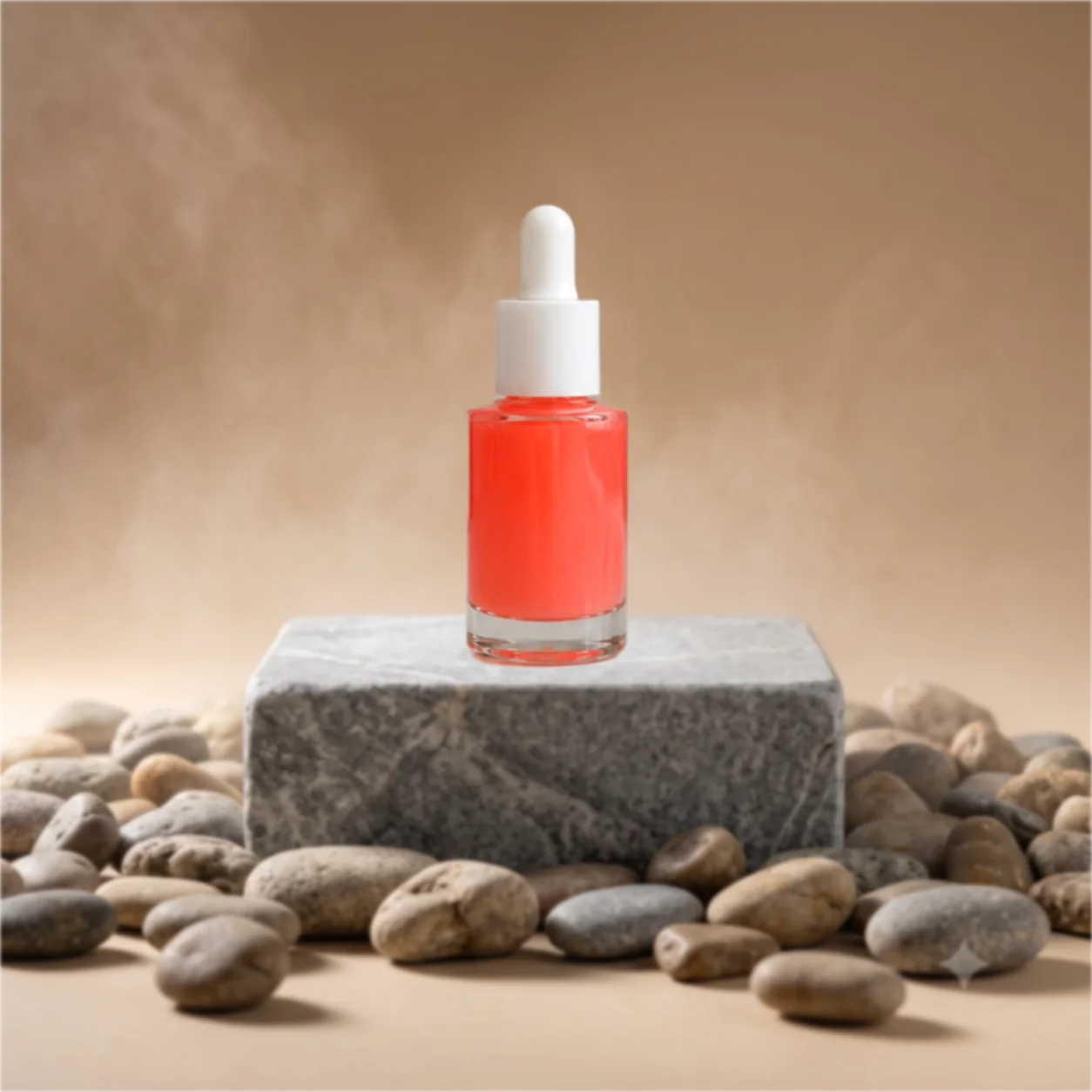
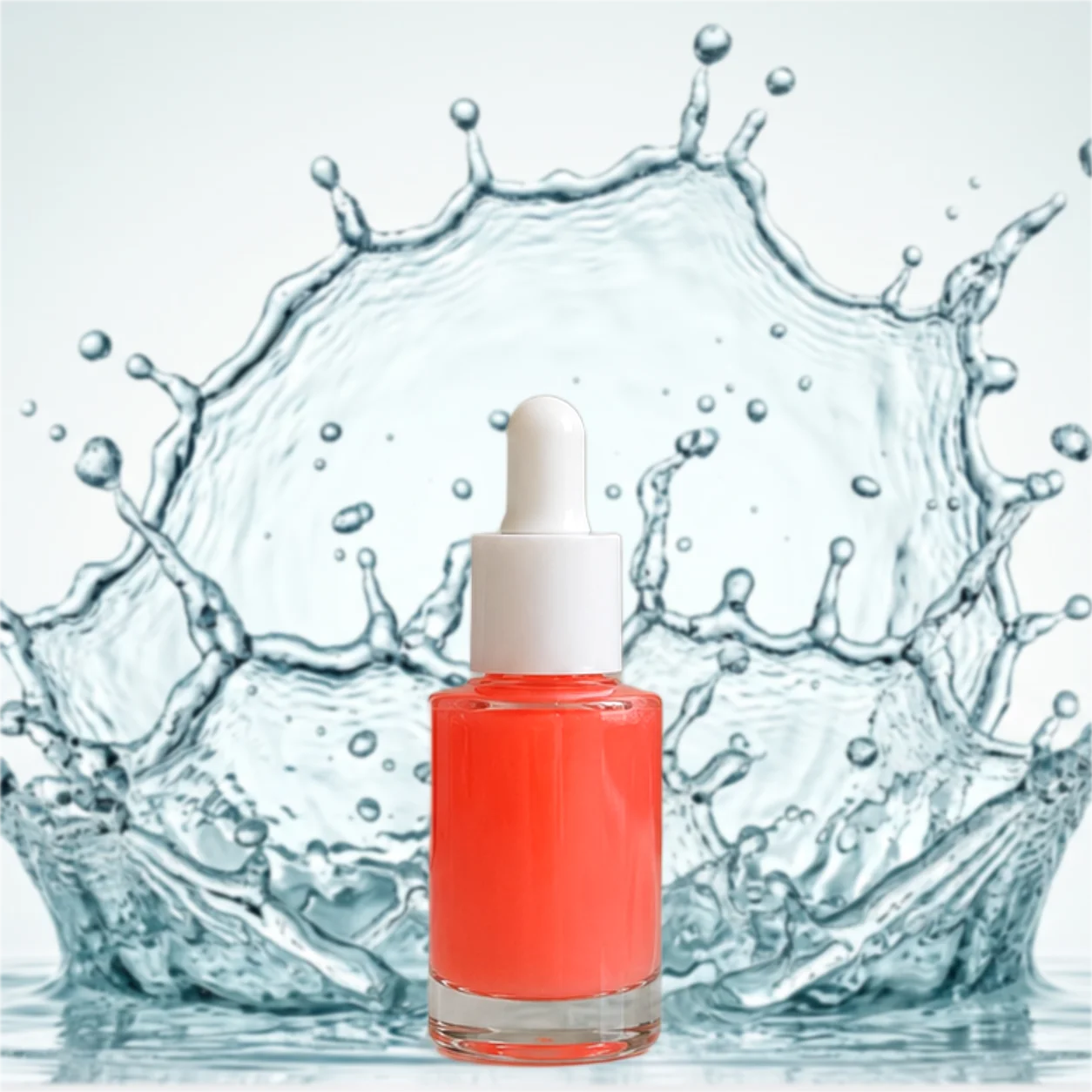
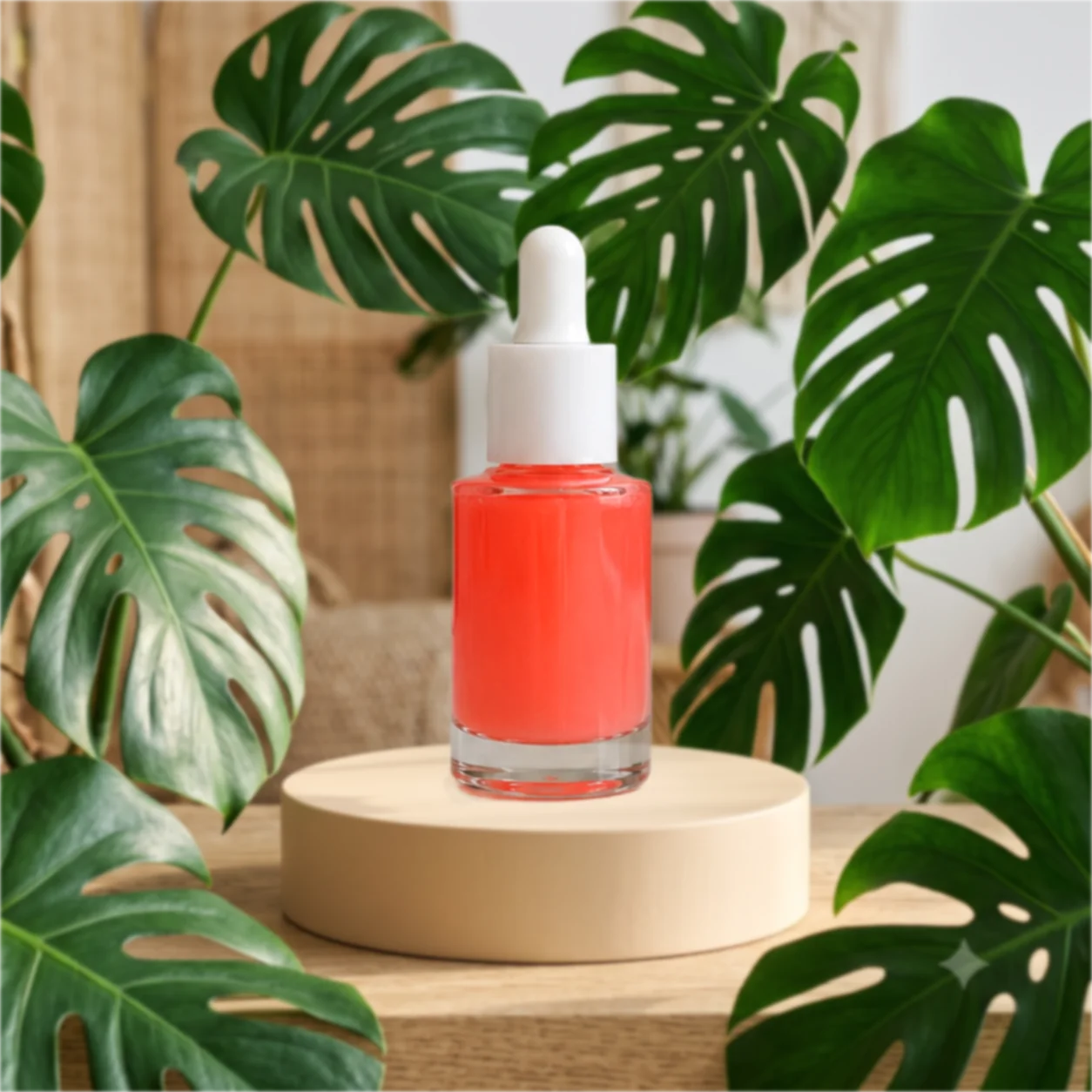
Each scene is a positioning statement, not just decoration. The stone pedestal signals mineral, natural and grounded, a fit for clean-ingredient positioning. The water splash signals freshness and hydration, the classic visual language of moisturisers and serums. The botanical podium signals organic and plant-based, the shorthand of green beauty. Same product, three different brand stories, and switching between them costs one backdrop swap instead of three studio sessions.
Marketing assets and ads
Ads need different aspect ratios than your store: vertical for Reels, square for Stories, horizontal for Search ads, square or portrait for Pinterest. The cutout file is the foundation; the ad is the cutout placed on a background with copy and a call-to-action.
Use the PictTools Image Cropper to adapt one master cutout to multiple ad ratios. Same product, consistent presentation across every paid surface, no separate shoot per channel.
Variants and the consistency problem
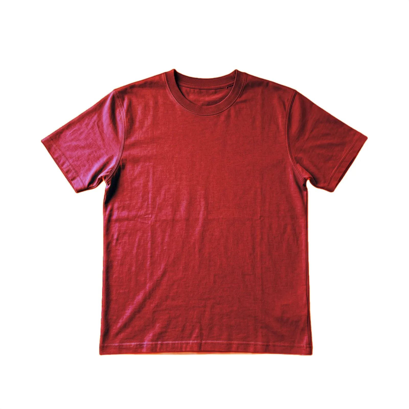
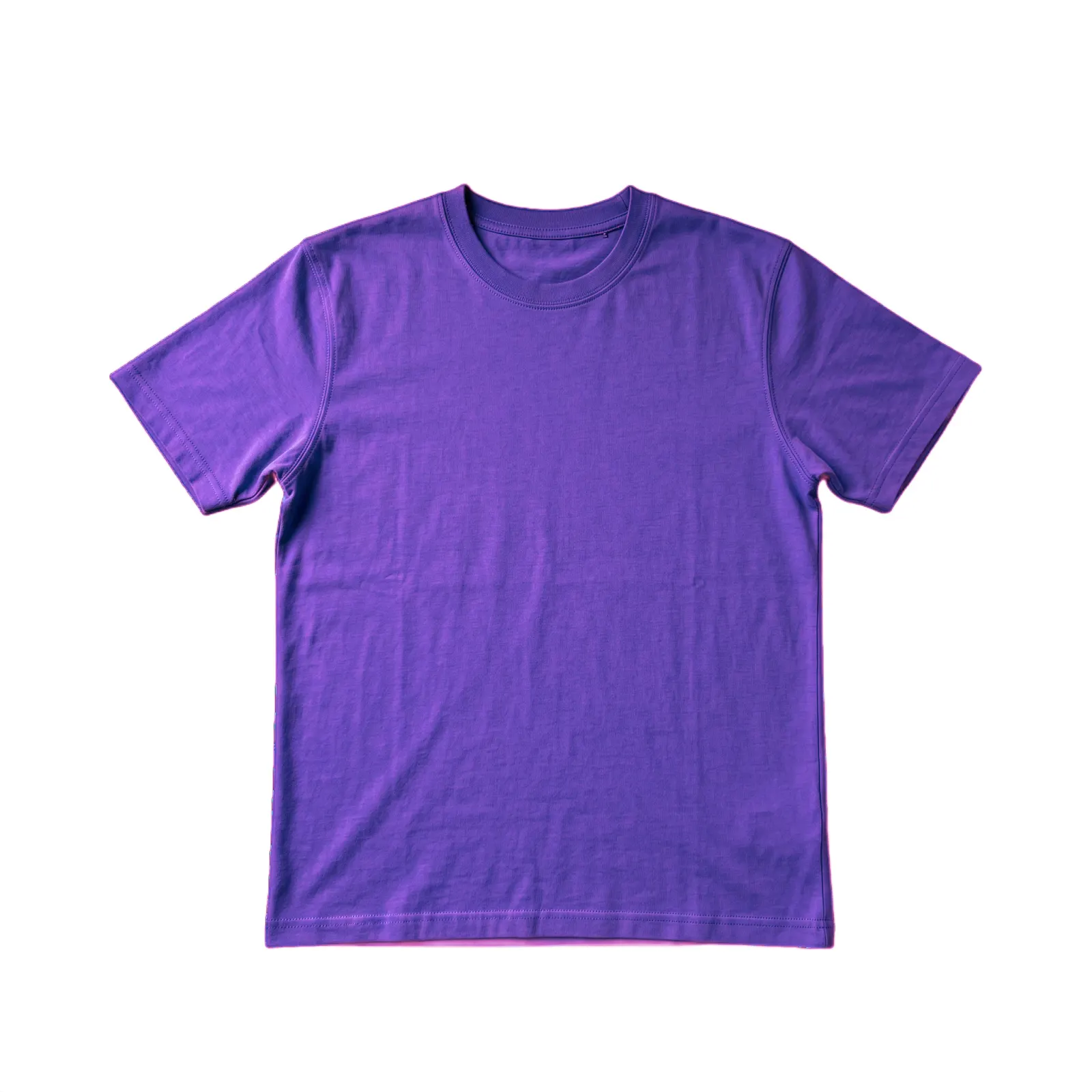
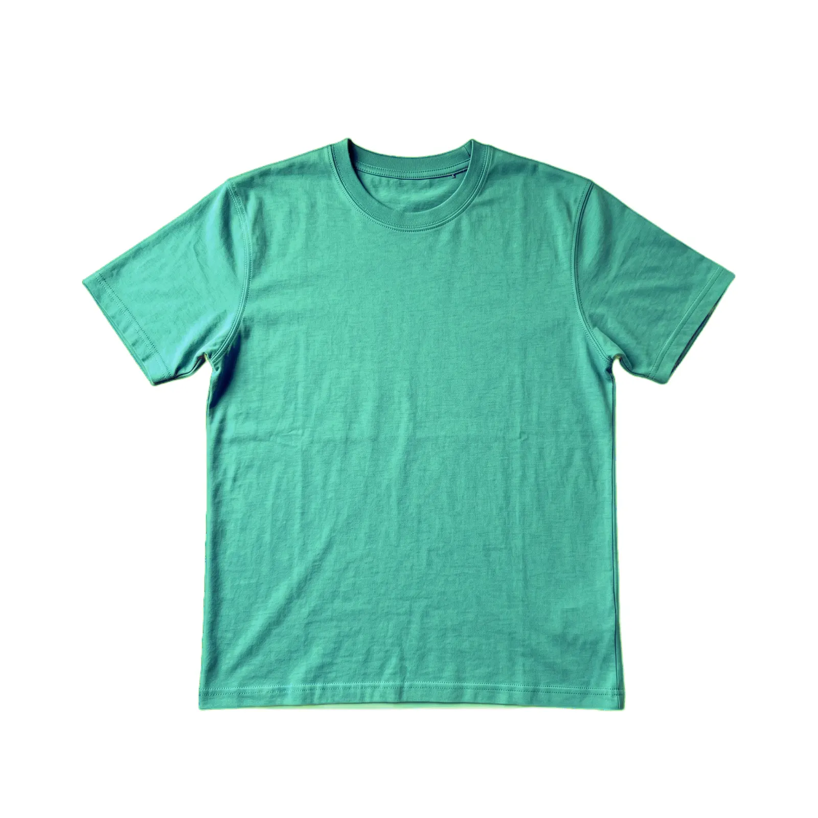
Variants are where catalog consistency breaks for most stores. A product has five color options. Each color gets its own photo. Five photos, taken weeks apart, with slightly different lighting and angles. The variant picker on your PDP shows the five photos next to each other. The inconsistency is visible.
Two practical rules. First, photograph all color variants in one session, under the exact same conditions. If you can shoot all five color samples at once on the same tripod with the same lighting, do it. Second, treat the cutouts as a set: cut them all the same way, on the same background, with the product in the exact same position in the frame. The variant picker should look like a color palette of one product, not five products that happen to be the same shape.
There is also a third path for color variants: photograph one colorway, cut it out, place it on your catalog background, then use the PictTools Color Changer to produce the remaining colors from the same source photo. Every variant keeps identical framing, lighting and background by construction. One rule applies: the generated color must accurately match the real product you ship.
For size variants where the photo does not change, use one master image across all sizes. Do not generate separate “XL version” photos that are just the same image with a tag. Size pickers should be text, not photos, when the photo content is identical.
Scaling your catalog without losing nights
A working catalog workflow looks roughly like this, whether you are starting fresh or migrating an existing store.
Define your visual system once. Pick exact values: background hex code, product-to-frame proportion (say 80%), shadow style (drop shadow or none), and crop ratio. Write them down. From now on, every product follows these specs.
Build a master file folder structure. One folder per product, containing the high-resolution cutout PNG. Name files consistently: product-slug-master.png. From these masters you generate every derivative on demand.
Migrate existing photos in stages. If your store already has 200 products with inconsistent photos, do not try to fix everything at once. Tackle a manageable set of products per session: download the original, run it through the AI Background Remover one image at a time, composite onto the chosen background, save the new master, regenerate Shopify uploads.
Add new products to the system from day one. Every new product follows the same photo-prep workflow before going live: shoot, cutout, master, derivatives, upload. The tool steps take seconds each once you have the rhythm.
Compress before upload. Shopify allows large files but store performance suffers. The PictTools Image Compressor cuts file sizes to a small fraction without visible quality loss, which helps page speed scores and SEO indirectly.
Once the workflow is in place, adding a new SKU to your store takes about as long as writing the product description. The photo prep stops being the bottleneck.
Common Shopify catalog mistakes
Even careful store owners trip over predictable patterns. Avoid these and your catalog already looks more polished than most competitors.
Mixed background shades across products. Off-white, then bright white, then warm cream, then pale gray. Each shot looks fine in isolation; the collection grid looks chaotic. Pick one exact value and stick to it.
Inconsistent crops within the same collection. One product fills 80% of the frame, the next fills 50%, the next is so close it nearly bleeds off the edges. The buyer's brain reads “different store” with every scroll.
Lifestyle photos in the product grid. One cutout, then one model wearing the next item, then a flat-lay scene. Save lifestyle for hero images and category banners; keep the product grid clean and uniform.
Heavy variation between variant photos. Same sweater, five colors, five completely different photos. Variants are a visual unit. Treat them like a set.
Treating each new product as a fresh project. Without a defined system, every new product reinvents the wheel. Decisions you made for the first product should be locked in and reused.
Skipping compression for the sake of quality. Uploading 8 MB product photos slows your store, hurts mobile load times, and the visible quality difference at display size is zero. Compress aggressively but cleanly.
Frequently asked questions
For the underlying step-by-step of how the AI Background Remover works on any photo, see our companion guide on removing the background from product photos. For the broader cross-platform strategy, see the platform-by-platform guide, and for the specific algorithm dynamics of marketplace selling, see our dedicated eBay seller guide.