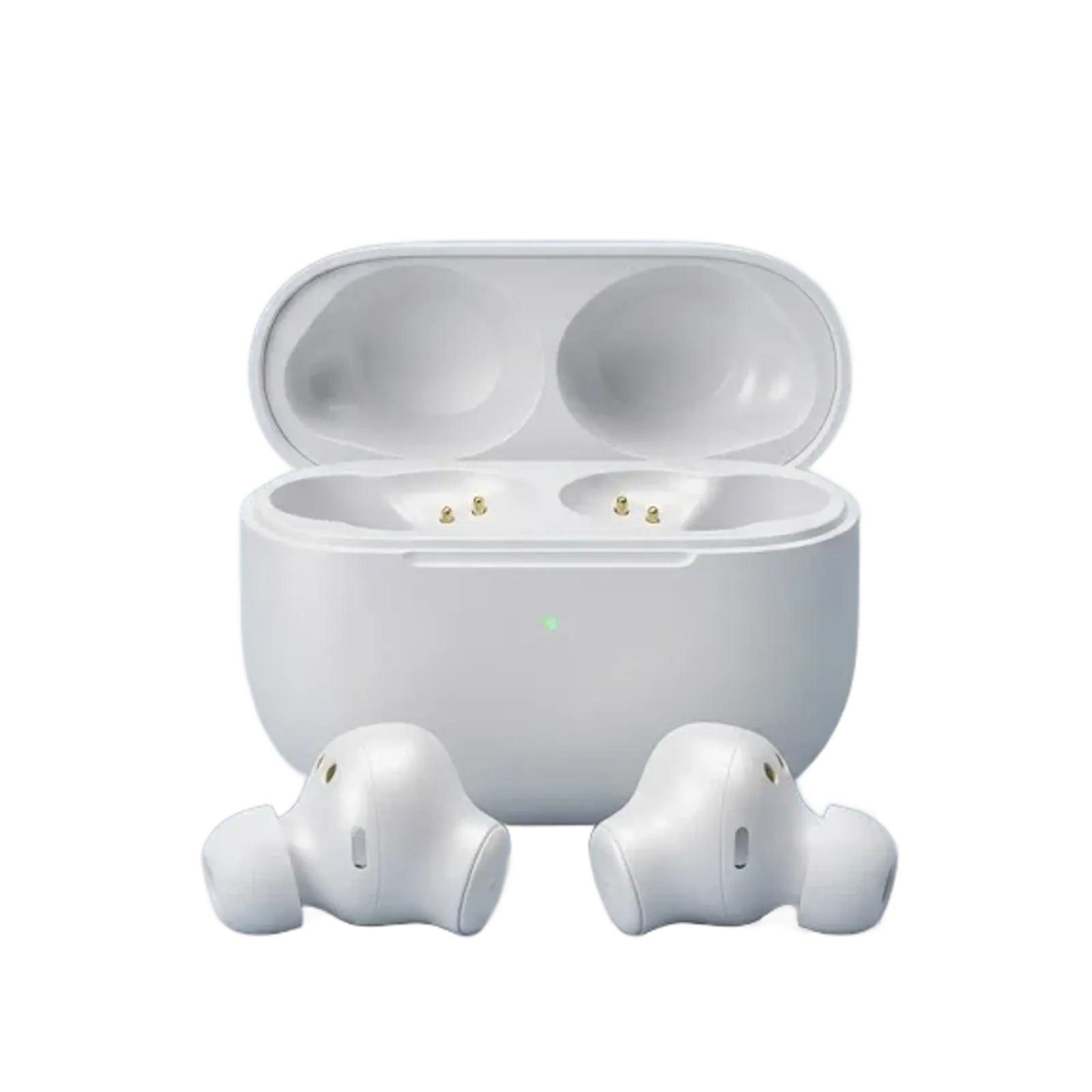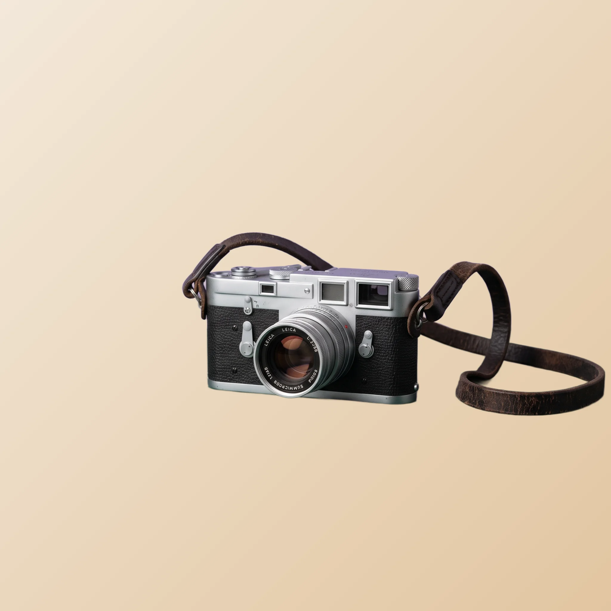
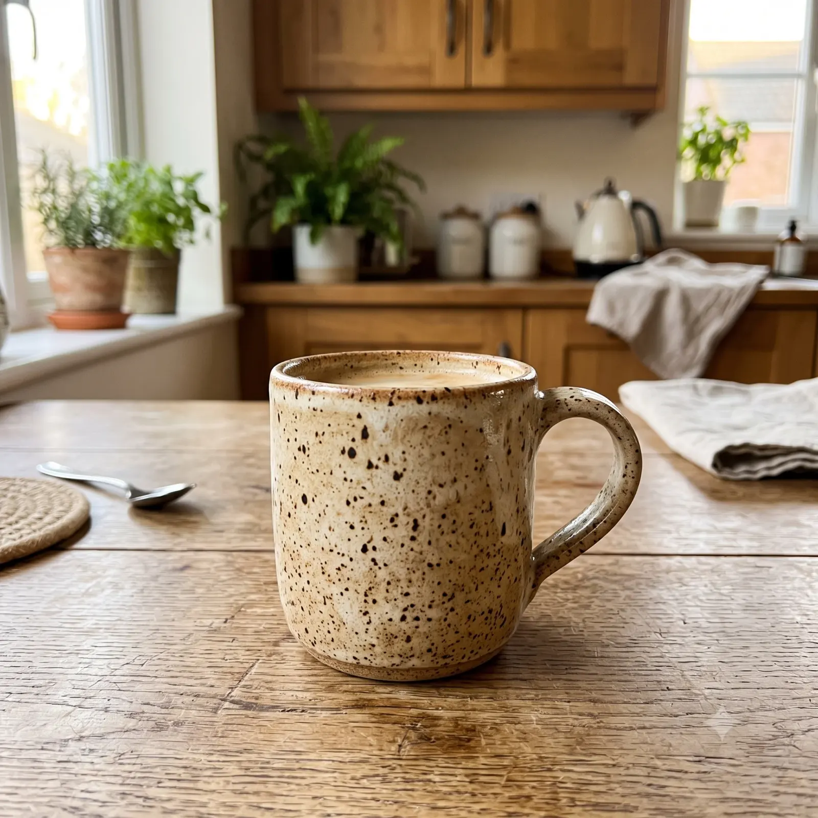
TL;DR. Etsy is not eBay and it is not Shopify. Buyers come here for aesthetic, for story, for handmade personality. Pure catalog cutouts feel sterile; styled photography wins. This guide covers the 10-photo storytelling framework, background choices by product category, the Pinterest amplifier loop, and how to build shop coherence without losing your visual personality.
Why Etsy plays by different rules
Etsy buyers are not bargain hunters and they are not catalog shoppers. They are people looking for something with character: a handmade ceramic mug, a vintage brooch, a custom print, an unusual print-on-demand t-shirt. The platform's culture rewards photography that reflects that character, and penalises photos that feel mass-produced.
This is the opposite of eBay or marketplace platforms. On marketplace platforms, clean cutout on white is the winning formula because it signals catalog professionalism. On Etsy, the same cutout in isolation can read as sterile and impersonal. The Etsy buyer wants to imagine the item in their kitchen, on their wall, in their wardrobe. Photography that helps them imagine wins.
The good news: AI background removal is still the foundation, but the next step is different. On Etsy, you cut the item out not to drop it on a sterile white background but to drop it onto a styled scene of your choosing. Same starting point, different destination.
The 10-photo storytelling framework
Etsy currently gives sellers ten photo slots per listing. Most sellers use three or four and call it done. The shops that consistently outsell their competition use all 10, and each photo earns its slot by adding new information or new emotion.
A 10-photo sequence that works for most product categories:
- Hero photo (your strongest aesthetic shot). The thumbnail in search results. Decides whether anyone clicks.
- Wide context photo. Item in the environment where it would live. A mug on a coffee table, a print on a wall, a piece of jewelry being worn.
- Tight detail close-up. Texture, stitching, brushstrokes, hardware. The maker quality of the item.
- Scale reference. Item next to something familiar (a hand, a coin, a known object) so the buyer understands real-world size.
- Alternate angle. Side, back, or three-quarter view of the item.
- Variant or option photo. If color, size, or personalisation options exist, show two or three.
- In-use photo. Item being worn, used, held, or in motion.
- Packaging. What the buyer will actually receive in the mail. Etsy buyers respond well to thoughtful packaging photography.
- Story or maker shot. Item being made, or you in your studio. Builds the maker connection.
- Banner or final aesthetic shot. One more beautiful composition to close the listing.
Not every listing needs all ten, but every listing should use at least five with deliberate intent. AI background removal feeds into this sequence by giving you the cutout of the product that you can drop into any of the styled scenes you want to build.
Background choices by Etsy category
Etsy spans wildly different product categories, and the photo aesthetic shifts with each one. To make the choices concrete, here is the same handmade mug cutout placed on three different backgrounds inside the AI Background Remover:
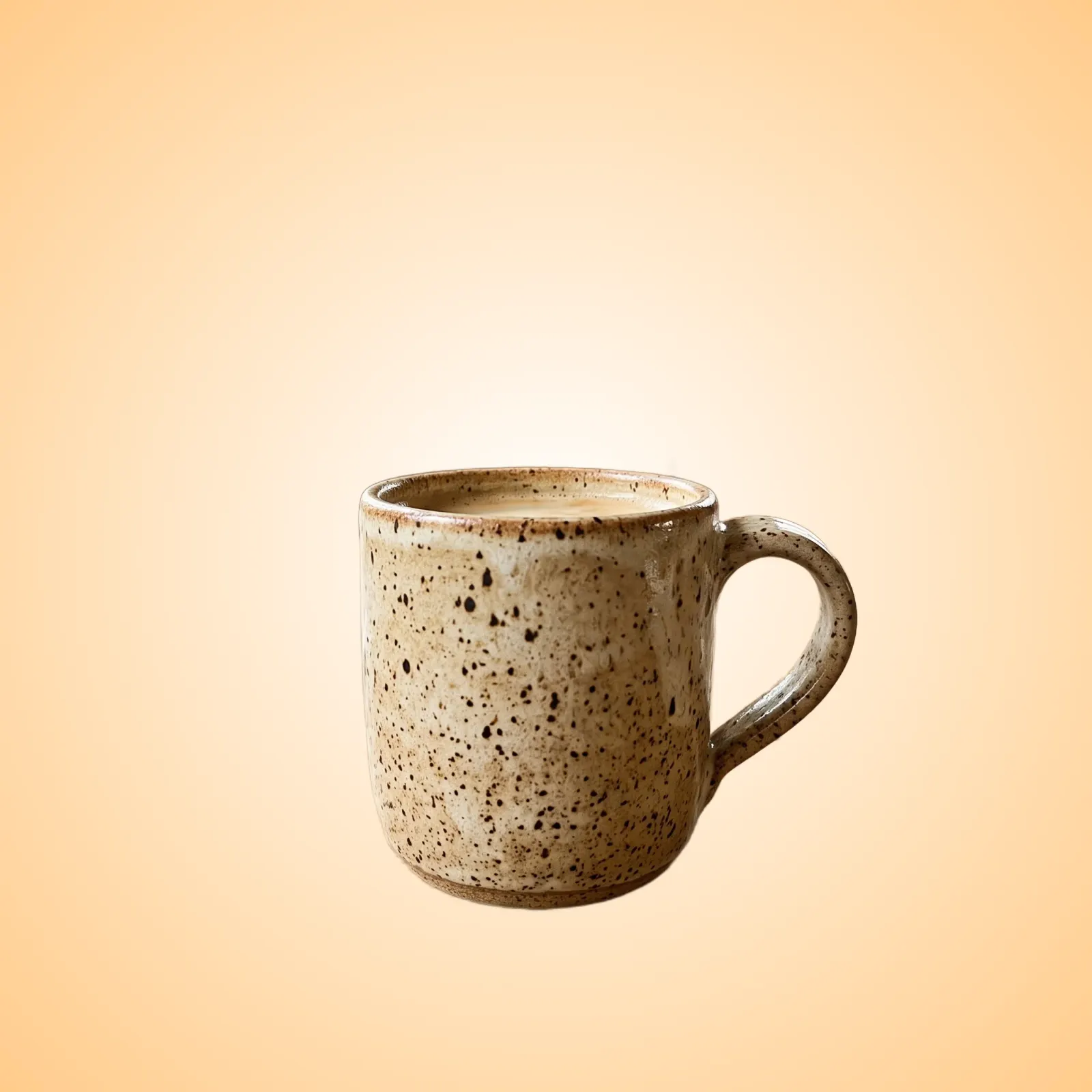
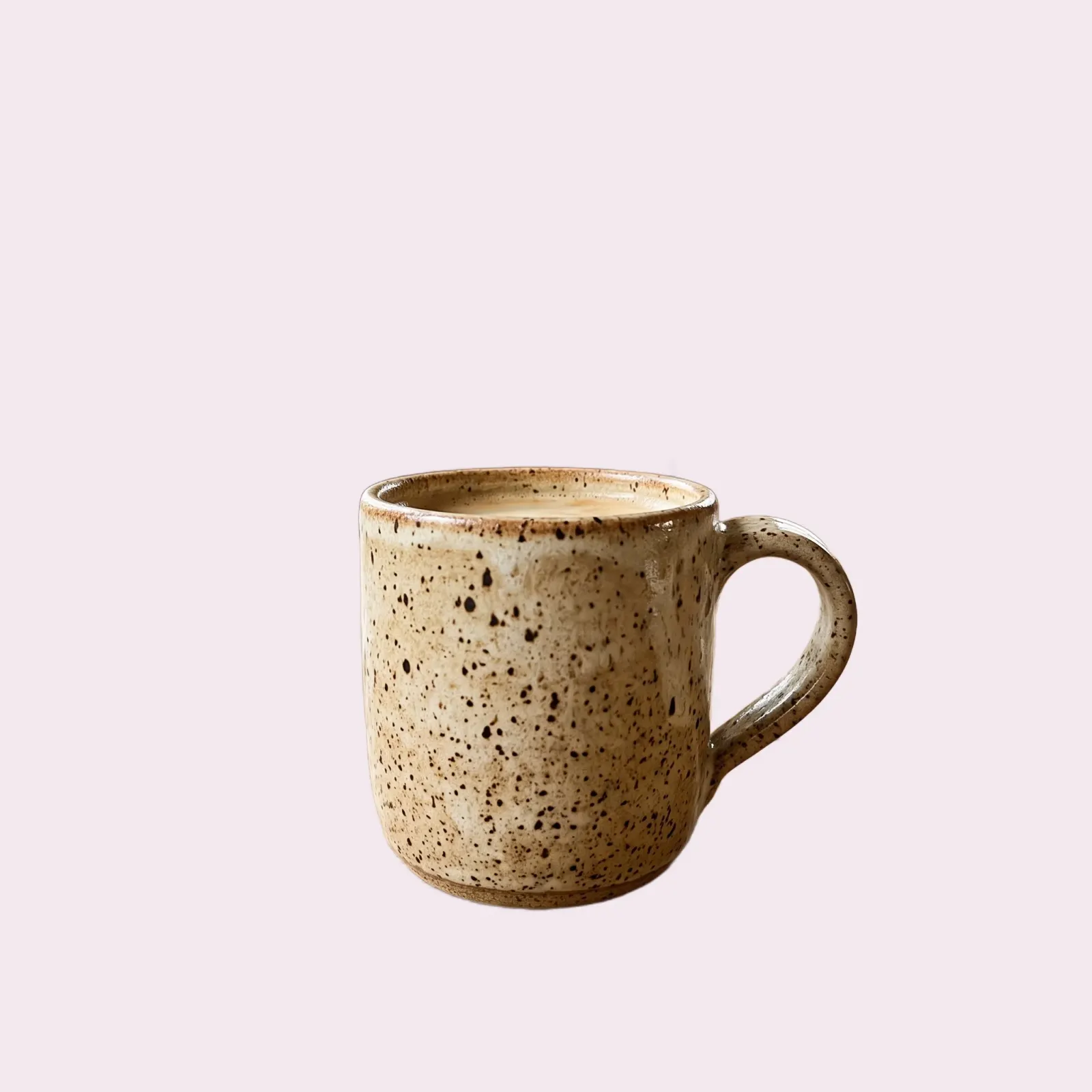
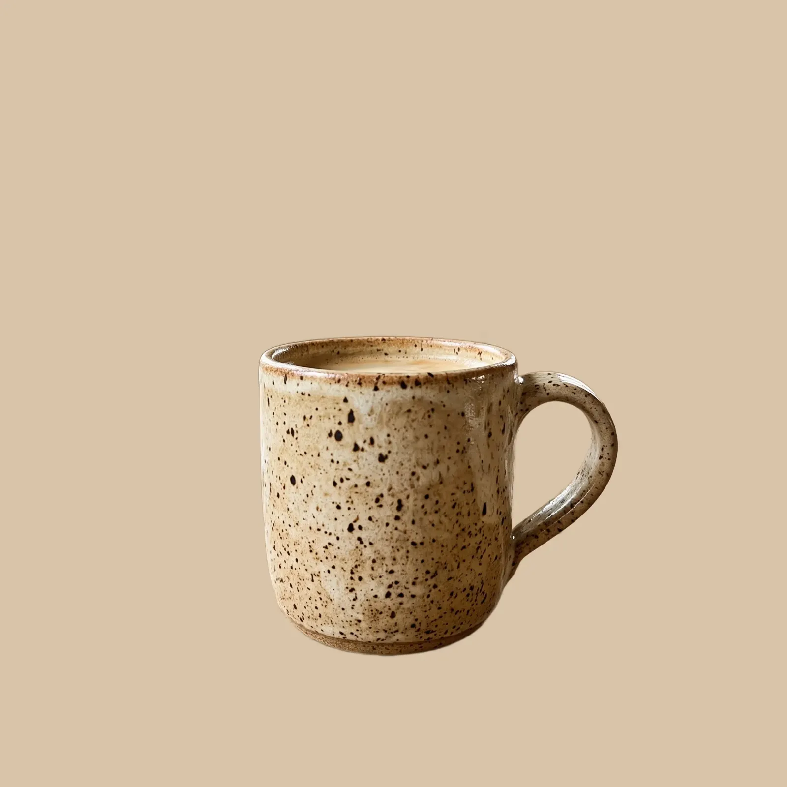
Each background tells a different shop story. The warm gradient reads cozy and giftable, a fit for kitchen goods and candles. The soft pastel reads delicate, the language of jewelry and accessories. The wood tone reads rustic and workshop-made, the natural home of woodwork and pottery. Here is what tends to work for the major categories.
Handmade items
Handmade ceramics, knitted goods, leather wallets, wooden kitchenware. Backgrounds that read as “artisan”: warm wood, raw linen, natural stone, neutral pottery. Avoid sterile white. The maker community responds to backgrounds that feel like a workshop or a thoughtful home, not a studio.
Use the cutout to composite your handmade item onto a styled surface you do not actually own. A shot of an oak desktop, a marble countertop, a textured cream paper. The composite reads as the real product in a curated setting.
Vintage finds
Vintage clothing, mid-century home decor, antique jewelry, old books. Backgrounds that match the item's era and mood: textured paper, aged wood, soft pastels, fabric backdrops suggestive of the period.
Vintage buyers respond to context that helps date and contextualise the item. A 70s ceramic vase against a 70s style wallpaper composite signals authentic curation. A vintage book next to a vintage style mug suggests a styled life rather than a junk drawer find.
Print-on-demand
T-shirts, mugs, posters, phone cases with original artwork. This category lives or dies on mockups. The product itself is manufactured by a fulfilment partner, so the listing photos are usually all mockups showing the design on the blank product.
AI background removal helps here in two ways. First, cut out the design itself and present it cleanly so buyers see the artwork without the mockup distortion. Second, cut out the mockup product (the t-shirt on a model, the mug on a desk) and composite onto consistent styled backgrounds so your shop's variety of designs feels coherent.
Digital downloads
Printable wall art, planner templates, SVG cut files, digital wedding stationery. The product is a file. The listing photos must convince the buyer the file will look good in their environment.
The pattern that works: show the digital product printed and styled in a beautiful real-world scene. A printable art piece in a frame on a styled wall. A planner page open on a wooden desk next to a coffee cup. AI background removal lets you composite the design file onto these styled scenes without actually printing and shooting every variant.
Craft supplies
Beads, fabric, yarn, charms, papers, kits. This is the one Etsy category where catalog-style cutouts on clean backgrounds actually work. Craft supply buyers shop like marketplace shoppers: they need to see the product clearly to evaluate quality, color, and quantity for their own project.
Cutout on a clean neutral background, with at least one photo showing the supplies in use (bracelet made with the beads, sweater knitted from the yarn) so buyers see the potential. This is the closest Etsy category to standard product photography.
How Pinterest changes the photo game
Many Etsy shoppers discover items through Pinterest, which means every Etsy listing is implicitly a Pinterest asset. Pins that get saved generate compounding traffic months after they are published. Pins that do not get saved go nowhere.
Pinterest rewards a different aspect ratio than Etsy. Etsy shows photos as squares; Pinterest favors vertical pins, usually in the 2:3 range. A square Etsy photo can be repinned as-is, but a custom Pinterest-first photo (vertical, with the product styled to leave room for a text overlay) tends to get substantially more engagement.
The smart workflow: generate your Etsy listing photos first, then create one or two Pinterest-optimized versions from the same source. Use the PictTools Image Cropper to convert the square to vertical, add the product cutout to a new background with space for a Pinterest-style title, and upload to Pinterest separately. Two channels, one source.
Building shop coherence
Etsy buyers who like one item from your shop often click through to your other listings. They are evaluating whether you are a one-off lucky find or a maker they want to follow. Shop coherence is what tips that evaluation.
Pick a visual signature and reuse it. Same set of background styles across your listings. Same lighting mood. Same approach to staging. Your shop should feel like a coherent visual identity, not a scrapbook of unrelated experiments. Buyers can spot the difference.
AI background removal helps because it gives you compositional control. Whatever the original photo, you can drop the cutout onto your chosen brand backgrounds. New products fit into the existing visual system from day one, no studio infrastructure required. Every listing starts from the same kind of neutral cutout:

Visual polish compounds the same way service polish does. The shop that looks coherent earns the second and third click, and repeat buyers remember the look they bought from last time.
Photo patterns that signal amateur shops
A handful of patterns appear over and over in low-performing Etsy shops. Avoid these and your shop already looks more intentional than most.
Phone shots on a kitchen counter, slightly off-angle, slightly underlit. The Etsy buyer is looking for intentional aesthetic; this signals lack of intent.
White cutouts only, with no lifestyle context. Works for craft supplies, fails for handmade and vintage. Buyers cannot imagine the item in their life without a context cue.
Mixed photo styles within a single listing. Hero shot styled and atmospheric, followed by detail shots photographed against the original kitchen counter. The inconsistency breaks the spell.
Inconsistent backgrounds across the shop. Each new listing uses a different aesthetic, so the shop has no coherent identity. Pick a small palette of background styles and reuse them.
Missing variant photos. If the listing offers five colors but only shows one, half your prospective buyers click away because they cannot picture the option they want.
The same photo across the listing's 10 slots. Lazy use of the 10-photo allowance signals to the buyer that you have not invested in the listing. Each slot should add information.
Ignoring Pinterest entirely. Optimizing only for Etsy's square thumbnail leaves a major traffic channel on the table. A vertical companion photo per listing is a tiny addition that compounds.
Frequently asked questions
For the step-by-step mechanics of how the AI Background Remover works on any photo, see our companion guide on removing the background from product photos. For the broader strategy across selling platforms, the platform-by-platform guide compares Etsy to eBay, Shopify, Vinted and Temu. For the catalog-first mindset that contrasts with Etsy's aesthetic-first culture, see our Shopify store guide.