TL;DR. Type your brand hex as the target rather than eyeballing it. Use Solid for logos, icons and flat illustrations, where the result lands on your exact value. Use Realistic for photographs, where the value becomes a range centered on your brand color so the object still looks lit. Mask when the same color appears elsewhere in the layout.
Why close is not the same as correct
Brand colors are specified precisely for a reason. A palette works because the same value appears everywhere, and the moment one asset drifts, the set stops feeling deliberate. The drift is rarely obvious in isolation. It shows up when two assets sit side by side in a deck, a carousel or a page, and one of them is subtly wrong.
Eyeballing a color is how drift starts. Two shades that look identical alone can be visibly different when adjacent, and monitors vary enough that a match made on one screen does not survive on another. The fix is not a better eye. It is entering the exact value and letting the tool hit it.
Getting your exact brand value
Start from the most authoritative source you have. Brand guidelines are best, and hex codes normally sit next to the logo files.
Where no guidelines exist, lift the value from your most official asset, usually the logo as it appears on your own site. In browsers that support it, the eyedropper picks up a color from anywhere on your screen, including a different window, so you can sample the live site without exporting anything. The control appears only where the browser offers it, so if it is missing, read the hex from your files and type it into the target field instead.
One sampling rule matters: take the value from a large flat area, never from an edge. Edge pixels are blends of the color and whatever sits behind it, which is why sampling a logo outline so often produces a value that is close to but not actually your brand color. That single mistake is a common source of the drift described above.

Two different jobs, two different methods
Brand work splits cleanly into two cases, and choosing the wrong method for each is the usual reason a result looks off.
Flat assets: logos, icons, illustrations
Anything drawn in software has no lighting, so there is nothing to preserve. Choose Solid, and the target color is applied evenly across everything that matched. The output lands on your exact hex.
This is the case where precision is fully achievable, and it covers most brand work: recoloring an icon set to a new accent, updating an illustration for a seasonal palette, or bringing an older asset in line with a refreshed identity.
Using Realistic here is the classic mistake. It preserves variation that a flat graphic should not have, leaving faint unevenness across an area that ought to be perfectly uniform. If the asset was drawn rather than photographed, use Solid.
Photographs: products and scenes
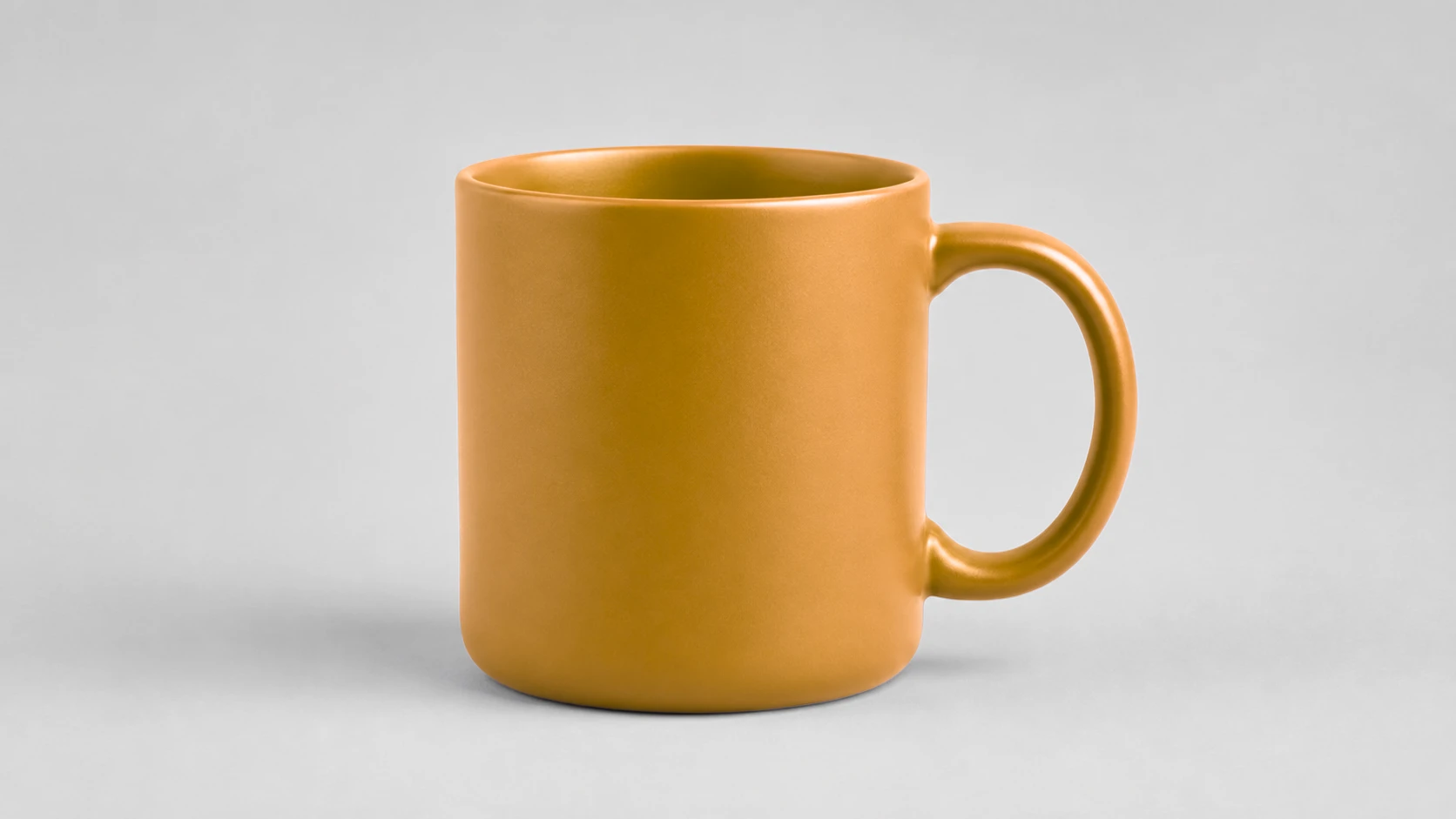
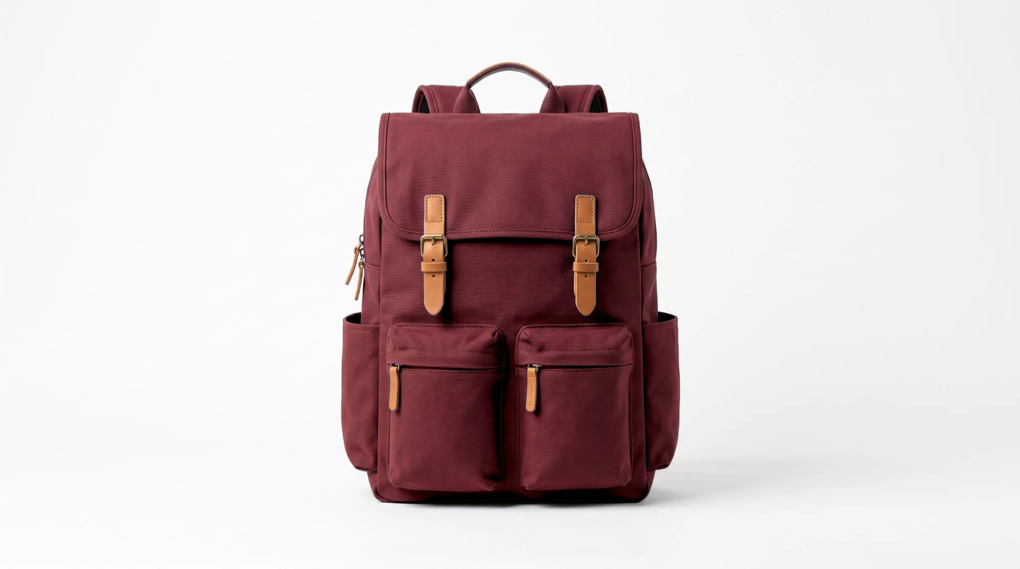
A photographed object is lit, so it has a bright side and a dark side. Choose Realistic, and that shading survives the swap.
The important thing to understand is that the result is deliberately a range rather than a single value. The lit face of a box sits above your brand hex, the shadowed face below it, and the average lands on your value. This is what makes the object still look like a photograph.
Forcing one flat value onto a photographed surface would remove the shading and the object would read as pasted in. When a brand guideline demands an exact value on a photograph, the honest answer is that the photograph carries your color rather than displaying it as a swatch, and that is the correct outcome.


Protecting the rest of the design
Brand assets are rarely a single color on an empty canvas. There is usually type, a background, a secondary mark and a border, and some of them may share tones with the element you are changing.
Tolerance alone cannot separate two things that are the same color, however carefully you set it. Masking can, because it adds a second condition: the pixel must match the source color and sit inside the area you drew. Draw over the element you are changing and everything else is protected regardless of its color.
In practice this means you can recolor a logo sitting on a background of a similar family without disturbing the background, or update one icon in a set without touching its neighbors. Layout, spacing and typography are never affected, because only matching pixels inside your masked area change.
Keeping a set consistent
When several assets need the same treatment, consistency comes from working deliberately rather than from any bulk feature. The tool handles one image at a time.
- Fix the target once. Enter the hex from your guidelines and use that identical value for every asset in the set. Never re-sample it from an asset you already converted, because small errors compound.
- Group assets by type. Do all the flat graphics with Solid, then all the photographs with Realistic. Switching method repeatedly is how the wrong one ends up applied.
- Work in one session. Settings you have already validated on the first asset carry across the rest, so a single focused pass is both faster and more consistent than returning to it later.
- Review the set together. Drift is invisible in isolation and obvious side by side. Put the finished assets next to each other before you ship any of them.
If you also need these assets sized for different placements, the Image Resizer handles that afterwards, and the Image Compressor keeps file sizes reasonable without guessing at quality. For the underlying controls in more detail, see the full guide to changing color in a photo.